Buttons
A button allows a user to perform an action or to navigate to another page. It contains a text label and a supporting icon can be displayed.
Page Summary
Specifications references
Accessibility
Please follow accessibility criteria for development
Variants
Emphasis button
Button variants range in style to denote emphasis. Use different styles and not size to show the preferred choice.
- Layout
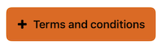
Large
Small
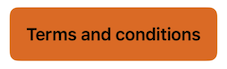
- Emphasis
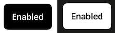
High emphasis
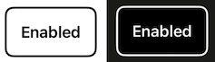
Medium
Low emphasis
Lowest emphasis


SwiftUI example
// High emphasis
ODSButton(text: Text("Some text"),
          image: Image("Add"),
          emphasis: .high) {}

// Lowest emphasis
ODSButton(text: Text("Some text"),
          image: Image("Add"),
          emphasis: .lowest) {}
ODSButton API
| Parameter | Default value | Description |
|---|---|---|
text: Text |
Text displayed into the banner. | |
image: Image? |
nil |
Icon displayed in the button before the text. |
emphasis: Emphasis |
The button’s emphasis’. | |
fullWidth: Bool |
false |
Defines the size of the button layout. Set to true means button takes all available space horizontally. Set to false, the size of the button is limited to the size of the text added by a padding round it. |
action: () -> Void |
Callback invoked on button click. |
Functional button
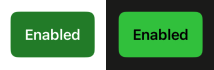
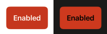
If required, colour versions can also be used to inform users of positive or negative destructive actions.
Positive
Negative
SwiftUI example
    // Negative button
    ODSFunctionalButton(text: Text("Some text"), style: .negative)
    { /* action: Do something */ }

    ODSFunctionalButton(text: Text("Some text"), image: Image("Add"), style: .negative)
    { /* action: Do something */ }

    // Positive button
    ODSFunctionalButton(text: Text("Some text") style: .positive)
    { /* action: Do something */ }

    ODSFunctionalButton(text: Text("Some text"), image: Image("Add"), style: .positive)
    { /* action: Do something */ }

    // To disable the button
    ODSFunctionalButton(text: Text("Some text"), style: .positive) { /* action: Do something */ }
    .disabled(true)
ODSFunctionalButton API
| Parameter | Default value | Description |
|——————————————-|——————–|———————————————————————————–|
| text: Text | | Text displayed into the banner. |
| image: Image? | nil | Icon displayed in the button before the text. |
| style: ODSFunctionalButton.Style | | Controls the style of the button. Use ODSFunctionalButton.Style.positive/ODSFunctionalButton.Style.negative to get a green/red button.
| fullWidth: Bool | false | Defines the size of the button layout. Set to true means button takes all available space horizontally. Set to false, the size of the button is limited to the size of the text added by a padding round it.
| action: () -> Void | | Callback invoked on button click. |
Icon button
Plain buttons are the most ubiquitous component found throughout applications. Consisting an icon, they are the most simple button style.
SwiftUI example
// icon with system asset
ODSIconButton(image: Image(systemName: "info.circle")) {}

// icon with Solaris asset
ODSIconButton(image: Image("Add")) {}
ODSIconButton API
| Parameter | Default value | Description |
|---|---|---|
image: Image |
Icon displayed in the button. | |
action: () -> Void |
Callback invoked on button click. |