List item
Lists are continuous, vertical indexes of text or images.
Page Summary
Specifications references
Accessibility
Please follow accessibility criteria for development
Variants
Here we just propose a configuration for two types of list items:
- Standard with trailing actions
- Selection with trailing icons (selection indicators)
All items are composed of:
- Title
- Subtitle (optional)
- Leading icon (optional)
The leading icon is :
- icon or image from resources
- Image from url. During image loading a placeholder Image is needed. Three kinds of shape are proposed (circular, square or wide).
Standard list item
For standard items, trailing icons can be added. Two types of icons are proposed:
- with text
- with text and info button to make an action
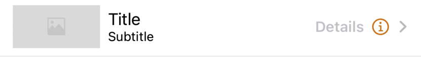

The standard item can be used in a NavigationLink (for example, display more details)
SwiftUI example
// Build the List view using ODSListItem withount navigation
List {
    // Items without navigation
    ODSListItem(title: Text("Title Only")).odsListItemStyle()
    ODSListItem(title: Text("Title with subtitle"), subtitle: Text("subtitle")).odsListItemStyle()
    ODSListItem(title: Text("Title with leading icon"), leading: .icon(Image(systemName: "heart"))).odsListItemStyle()
    ODSListItem(title: Text("Title with trailing text"), trailingText: Text("Details")).odsListItemStyle()
    ODSListItem(title: Text("Title with trailing text and info button"), trailingText: Text("Details")) {
        // Add info button action here
    }.odsListItemStyle()

    // Item with navigation
    NavigationLink {
        Text("The destination view")
    } label: {
        ODSListItem(title: Text("Title without trailing element"))
    }.odsListItemStyle()

    NavigationLink {
        Text("The destination view")
    } label: {
        ODSListItem(title: Text("Title with trailing text"), trailingText: Text("Details"))
    }.odsListItemStyle()

    NavigationLink {
        Text("The destination view")
    } label: {
        ODSListItem(title: Text("Title with trailing text and info button"), trailingText: Text("Details")) {
            // Add info button action here
        }
    }.odsListItemStyle()
}
Selection list item
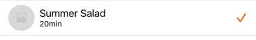

The selection list items can be used to enumerate data as list in order to select elements.
SwiftUI example
struct MyMultipleOptionsSelection: View {

    @State private var optionA: Bool = false
    @State private var optionB: Bool = false

    var body: some View {
        List {
            ODSListItem(
                title: Text("Option A"),
                subtitle: Text("Option A description"),
                trailingCheckmarkIsSelected: optionA
            )
            .odsListItemStyle()
            .onTapGesture {
                optionA.toggle()
            }

            ODSListItem(
                title: Text("Option B"),
                subtitle: Text("Option B description"),
                trailingCheckmarkIsSelected: optionB
            )
            .odsListItemStyle()
            .onTapGesture {
                optionB.toggle()
            }
        }
    }
}
ODSListItem API
| Parameter | Default value | Description |
|---|---|---|
title: Text |
The primary text of the list item. | |
subtitle: Text? |
nil |
The secondary (optional) text of the list item. |
subtitleNumberOfLines: SubtitleNumberOfLines? |
.one |
To limit the subtitle text to 1 or 2 lines. |
leading: Self.Leading? |
nil |
The leading icon (optional) of the list item. |
trailing: Self.Trailing? |
nil |
The trailing element (optional) of the list item. |
Note 1: Don’t forget, if item is used in a NavigationLink, a chevron is automatically added by the system. For design purpose it is NOT recommended to add item with trailingCheckmarkIsSelected and trailingToggleIsOn parameters in a NavigationLink.
Note 2:Don’t forget to apply the style on:
- ODSListItem if it is not used with NavigationLink.
- NavigationLink if ODSListItem is its label.