Chips
Chips are compact elements that represent an input, attribute, or action.
Page summary
Specifications references
Accessibility
Please follow accessibility criteria for development
Chips support dynamic types for accessibility.
Chips support content labeling for accessibility and are readable by most screen readers. Text rendered in chips is automatically provided to accessibility services. Additional content labels are usually unnecessary.
Variants
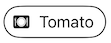
Action chip
Action chips offer actions related to primary content. They should appear dynamically and contextually in a UI. An alternative to action chips are buttons, which should appear persistently and consistently.

SwiftUI example
ODSActionChip(
    text: Text("chip text"),
    Image(systemname: "heart")
    action: { doSomething() }
)
ODSActionChip API
| Parameter | Default value | Description |
|---|---|---|
text: Text |
Text to be displayed into the chip. | |
leadingIcon: Image? |
nil |
Optional leading icon to be displayed at the start of the chip, preceding the content text. |
action: () -> Void |
The action when chip is clicked. |
Remarks:
- To disable the chip call the
.disabledon View.
Input chip
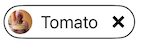
Input chips represent a complex piece of information in compact form, such as an entity (person, place, or thing) or text. They enable user input and verify that input by converting text into chips.

SwiftUI example
// Input chip with leading filled with icon or image for resources

ODSInputChip(
    text: Text(vhip text),
    leadingAvatar: .image(Image("Avatar")),
    action: { doSomething() },
    removeAction: { doSomething() }
)
ODSInputChip API
| Parameter | Default value | Description |
|---|---|---|
text: Text |
Text to be displayed into the chip. | |
leadingAvatar: ODSImage.Source? |
nil |
Optional leading avatar to be displayed in a circle shape at the start of the chip, preceding the content text. |
action: () -> Void |
The action when chip is clicked. | |
removeAction: () -> Void |
The action when cross is clicked. |
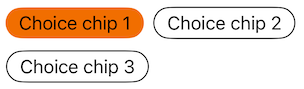
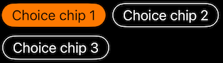
Choice chip
Choice chips allow selection of a single chip from a set of options. Choice chips clearly delineate and display options in a compact area.
Note: To display a set of choice chips please see ODSChoiceChipsPicker
SwiftUI example
enum Ingredient: String, CaseIterable {
    case chocolate, vanilla, strawberry
}

ODSChoiceChipView(
    chip: ODSChoiceChip(text: Text("Chocolate"), value: .chocolate),
    selected: false:
    action: { doSomething() }
)
ODSChoiceChipView(
    chip: ODSChoiceChip(text: Text("Vanilla"), value: .vanilla),
    selected: true:
    action: { doSomething() }
)
ODSChoiceChipView API
| Parameter | Default value | Description |
|---|---|---|
ODSChoiceChip<Value> |
The chip value and associated text description. | |
selected: Bool |
Controls the selected state of the chip. | |
action: () -> Void |
The action when chip is clicked. |
ODSChoiceChipPicker
In order to display a set of choice chips you can follow this example:
@State var selection: Ingredient

var body: some View {
    ScrollView(.horizontal) {
        ForEach(Ingredient.allCases, id: \.rawValue) { ingredient in
            ODSChoiceChipView(
                model: ODSChoiceChip(text: Text(ingredient.rawValue), value: ingredient),
                selected: selection == ingredient,
                action: { selection = ingredient }
            )
        }
    }
}
To simplify the chips placement and alignment, you can also use the ODSChoiceChipsPicker like this:
@State var selection: Ingredient

ODSChoiceChipPicker(
    title: Text("Select your ingredient"),
    chips: Ingredient.allCases.map { ODSChoiceChip(text: Text($0.rawValue), value: $0)
    selection: $selection,
    placement: .carousel
)
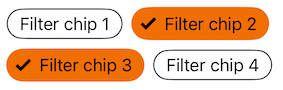
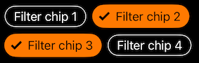
Filter chip
Filter chips use tags or descriptive words to filter content. Filter chips allow selection of a set of chips from a set of options. Its usage is usefull to apply a filtering on a list of elmeents.
Note: To display a set of filter chips please see ODSFilterChipsPicker
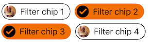
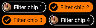
SwiftUI example
enum Ingredient: String, CaseIterable {
    case chocolate, vanilla, strawberry

    var image: Image {
        Image("self.rawValue")
    }
}

ODSFilterChipView(
    chip: ODSFilterChip(text: Text("Chocolate"), leading: .image(Image("avatar")), value: .chocolate),
    selected: false:
    action: { doSomething() }
)
ODSFilterChipView API
| Parameter | Default value | Description |
|---|---|---|
chip: ODSFilterChip<Value> |
The chip value and associated text description and leading avatar. | |
selected: Bool |
Controls the selected state of the chip. | |
action: () -> Void |
The action when chip is clicked. |
ODSFilterChip API
| Parameter | Default value | Description |
|---|---|---|
text: Text |
Text to be displayed into the chip | |
leading: ODSImage.Source? |
nil |
Avatar to be displayed in a circle shape, preceding the text. |
value: Value |
The value associated to the chip. | |
disabled: Bool |
false |
Controls the disbaled state of the chip. |
ODSFilterChipPicker
As the choice chip, to simplify the chips placement and alignment, you can also use the ODSFilterChipsPicker like this:
@State var selection: [Ingredient]

ODSFilterChipPicker(
    title: Text("Select your ingredients"),
    chips: Ingredient.allCases.map { ODSFilterChip(text: Text($0.rawValue), leading(.image($0.image)), value: $0)
    selection: $selection,
    placement: .carousel
)