List
Lists are continuous, vertical indexes of text or images.
Page Summary
Specifications references
Accessibility
Please follow accessibility criteria for development
List styles
List propose the .listStyle(_:) modifier to change the style. For ios SwiftUI propose 6 types of style:
- automatic
- insetGrouped
- grouped
- inset
- plain
- sidebar
The folowing code is used for all styles. The only difference is the list style specified in the .listStyle(_:) modifier.
NavigationStack {
    List {
        // Section for recipes contain selected ingredients
        Section {
            ODSListItem(
                title: Text("Summer Salad"),
                subtitle: Text("21 mn"),
                leading: .circularImage(source: .image(Image("summerSalad")))
            )
            ODSListItem(
                title: Text("Salmon cury"),
                subtitle: Text("31 mn"),
                leading: .circularImage(source: .image(Image("salmonCury")))
            )
            ODSListItem(
                title: Text("Feta Pizza"),
                subtitle: Text("21 mn"),
                leading: .circularImage(source: .image(Image("fetaPizza")))
            )
        } header: {
            Text("Recipes")
        } footer: {
            Text("A set of recipes made with selected ingredients")
        }

        // A set of ingredients
        Section("Ingredients") {
            ODSListItem(title: Text("tomato"), leading: .circularImage(source: .image(Image("tomato"))))
            ODSListItem(title: Text("avocado"), leading: .circularImage(source: .image(Image("avocado"))))
        }
    }
    .navigationTitle("List Style")
    .listStyle(.automatic)
}
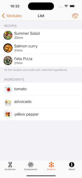
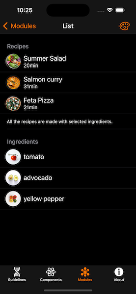
Automatic style
As mentioned earlier, SwiftUI will use Inset Grouped style when setting automatic (.automatic) or DefaultListStyle on iOS
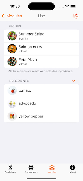
Inset Grouped style
Example of Inset Grouped .insetGrouped or InsetGroupedListStyle.
List {
    // ...
}
.listStyle(.insetGrouped)


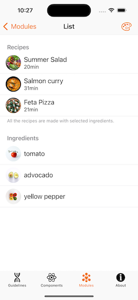
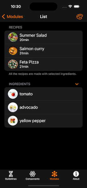
Grouped style
Example of Grouped .grouped or GroupedListStyle.
List {
    // ...
}
.listStyle(.grouped)
Inset style
Example of Inset .inset or InsetListStyle.
List {
    // ...
}
.listStyle(.inset)
Plain style
Example of Plain .plain or PlainListStyle.
List {
    // ...
}
.listStyle(.plain)

Sidebar style
The sidebar list style displays disclosure indicators in the section headers that allow the user to collapse and expand sections.
Tap on disclosure indicators in the section headers will collapse and expand that section.
List {
    // ...
}
.listStyle(.sidebar)
- For iOS 17, a new API is proposed to manage the expandable state.
@State var isExpanded = true

List {
    Section(isExpanded: $isExpanded) {
        // ...
    } header: {
        Text("Recipes")
    }
}
.listStyle(.sidebar)
When you create your Section with isExpanded, the chevron will appear as long as the list style is .sidebar.
- On previous iOS versions, this interface is not available, so to do the same you can use following code:
@State var isExpanded = true

List {
    Section {
        if isExpanded {
            // The content
        }
    } header: {
        HStack {
            Text("Recipes") // The header

            Spacer()
            Image(systemName: "chevron.down")
            .rotationEffect(isExpanded ? .zero : .degrees(-90))
            .onTapGesture {
                withAnimation {
                    isExpanded.toggle()
                }
            }
        }
    }
}
.listStyle(.sidebar)