Progress indicator
Progress indicators show users that elements or pages are loading
Page Summary
Specifications references
Accessibility
Please follow accessibility criteria for development
Variants
Progress indicators show users that elements or pages are loading.
Progress bar
Progres bar is used to display determinate operations. It display the indicator increasing in width from 0 to 100% of the track, in sync with the process’s progress.
To display the indicator as progress bar with a specific color use the tint.

We recommend to use the theme for that using the accent color as shown in following exemple.
ProgressView("Downloading...", value: value, total: 100)
    .tint(theme.componentColors.accent)
It is possible to display the current value to provide more context.
ProgressView(value: value, total: 100) {
    Text("Downloading...")
} currentValueLabel: {
    let percent = String(format: "%0.2f", value)
    Text("\(percent) %").frame(maxWidth: .infinity, alignment: .trailing)
}
.tint(theme.componentColors.accent)
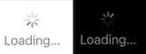
Activity indicators
Activity indicator is used to display Indeterminate operations. It spins while a task is performed.
ProgressView()
An additional label can be added to provide more context.
ProgressView {
   Text("Loading...")
}