Cards
Cards contain content and actions about a single subject.
Page Summary
Specifications references
Accessibility
Please follow accessibility criteria for development
Images in cards are considered as decorative, so they are ignored by Voice Over.
Variants
Cards are a contained and independent element that can display content and actions on a single topic.
There are a few ways cards can be presented. Ranging from a single title on its own for a simple card view or with more information shown in a subtitle and supporting text and actions at the bottom of the card.
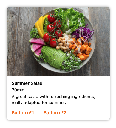
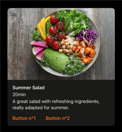
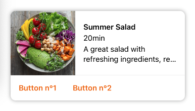
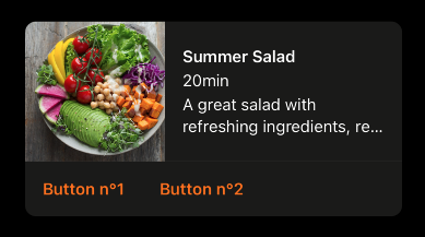
Vertical Image First Card
This is a full width card displayed with an image as first element.
This card is composed of two parts:
- Media: (today an image)
- Content: with a title, an optional subtitle an optional supporting text and optional buttons (zero up to two)
SwiftUI example
Card is configured like this:
ODSCardVerticalImageFirst(
    title: Text("Title"),
    imageSource: .image(Image("placeholder", bundle: Bundle.ods)),
    subtitle: Text("Subtitle"),
    text: Text("A supporting text to describe something")
) {
   Button("Button 1") {
        // do something here
    }
} secondButton: {
    Button("Button 2") {
        // do something here
    }
}
ODSCardVerticalImageFirst API
| Parameter | Default value | Description |
|---|---|---|
title: Text |
Title displayed into the card. | |
imageSource: ODSImage.Source |
Image displayed in the card. | |
subtitle: Text? |
nil |
Subtitle (optional) displayed into the card. |
text: Text |
nil |
Text (optional) displayed into the card. |
firstButton: Button<Text> |
Primary (leading) button displayed in the card. | |
secondButton: Button<Text> |
Secondary (trailing) button displayed into the card next to the first one. |
Remarks:
- To get a card without button, use the right initializer without
firstButtonandsecondButton. - To handle action when card is clicked, add it into a
Buttonor inNnavigationLinkor add a.onTapGesturemodifier.
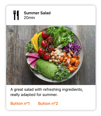
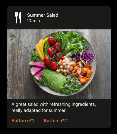
Vertical Header First Card
This is a full width card displaying with a title and a thumbnail on top as first element.
This card is composed of three parts:
- Header: with a title, an optional subtitle and an optional thmubnail
- Media: (today an image)
- Content: with an optional supporting text and optional buttons (zero up to two)
SwiftUI example
Card is configured like this:
ODSCardVerticalHeaderFirst(
    title: Text("Title"),
    imageSource: .image(Image("placeholder", bundle: Bundle.ods)),
    subtitle: Text("Subtitle"),
    thumbnailSource: .image(Image("placeholder", bundle: Bundle.ods)),
    text: Text("A supporting text to describe something")
) {
   Button("Button 1") {
        // do something here
    }
} secondButton: {
    Button("Button 2") {
        // do something here
    }
}
ODSCardVerticalHeaderFirst API
| Parameter | Default value | Description |
|---|---|---|
title: Text |
Title displayed into the card. | |
imageSource: ODSImage.Source |
Image displayed in the card. | |
subtitle: Text? |
nil |
Subtitle (optional) displayed into the card. |
thumbnailSource: ODSImage.Source? |
nil |
Thumbnail displayed into the card next to the title: avatar, logo or icon. |
text: Text |
nil |
Text (optional) displayed into the card. |
firstButton: Button<Text> |
Primary (leading) button displayed in the card. | |
secondButton: Button<Text> |
Secondary (trailing) button displayed into the card next to the first one. |
Remarks:
- To get a card without button, use the right initializer without
firstButtonandsecondButton. - To handle action when card is clicked, add it into a
Buttonor inNnavigationLinkor add a.onTapGesturemodifier.
Horizontal Card
This is a full width card displaying with image on left and content with texts on the right. Additonal action buttons can be added at the bottom of the card.
Thes content is composed by:
- a title
- an optional subtitle
- an optional text for larger description
SwiftUI example
Card is configured like this:
ODSCardHorizontal(
    title: Text("Title"),
    imageSource: .image(Image("placeholder", bundle: Bundle.ods)),
    imagePosition: .leading,
    subtitle: Text("Subtitle"),
    text: Text("A supporting text to describe something")
) {

    Button("Button 1") {
            // do something here
    }
} secondButton : {
    Button("Button 1") {
        // do something here
    }
}
ODSCardHorizontal API
| Parameter | Default value | Description |
|---|---|---|
title: Text |
Title displayed into the card. | |
imageSource: ODSImage.Source |
Image displayed in the card. | |
imagePosition: Self.ImagePosition |
.leading |
The side where image is placed. |
subtitle: Text? |
nil |
Subtitle (optional) displayed into the card. |
text: Text |
nil |
Text (optional) displayed into the card. |
firstButton: Button<Text> |
Primary (leading) button displayed in the card. | |
secondButton: Button<Text> |
Secondary (trailing) button displayed into the card next to the first one. |
Remarks:
- To get a card without button, use the right initializer without
firstButtonandsecondButton. - To handle action when card is clicked, add it into a
Buttonor inNnavigationLinkor add a.onTapGesturemodifier.
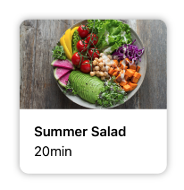
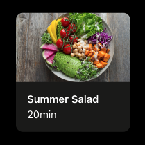
Small Card
The small card if prefered for two-column portrait mobile screen display. As it is smaller than full-width cards, it contains only title and subtitle (optional) in one line (Truncated tail).
SwiftUI example
Card is configured like this:
ODSCardSmall(
    title: Text("Title"),
    imageSource: .image(Image("placeholder", bundle: Bundle.ods)),
    subtitle: Text("Subtitle")
)
ODSCardSmall API
| Parameter | Default value | Description |
|---|---|---|
title: Text |
Title displayed into the card. | |
imageSource: ODSImage.Source |
Image displayed in the card. | |
subtitle: Text? |
nil |
Subtitle (optional) displayed into the card. |
titleAccessibleLineLimit: Int? |
nil |
The line limit to apply to the title if size category is accessibility category |
subtitleAccessibleLineLimit: Int? |
nil |
The line limit to apply to the subtitle if size category is accessibility category |
Remark:
- To handle action when card is clicked, add it into a
Buttonor inNnavigationLinkor add a.onTapGesturemodifier.
How to add Small Card in Grid
class Model {
    let title: String
    let subtitle: String?
    let imageSource: ODSImage.Source

    init(title: String, imageSource: ODSImage.Source, subtitle: String? = nil) {
        self.title = title
        self.imageSource = imageSource
        self.subtitle = subtitle
    }
}


let models = [
    Model(
        title: "Title 1",
        imageSource: .image(Image("placeholder", bundle: Bundle.ods)),
        subtitle: "Subtitle 1"
    )
    Model(
        title: "Title 2",
        imageSource: .image(Image("placeholder", bundle: Bundle.ods)),
        subtitle: "Subtitle 2"
    )
    //...
]

/// /!\ Don't forget to put the grid into a scrollview
ScrollView {
    LazyVGrid(columns: columns, spacing: ODSSpacing.none) {
        ForEach(models, id:\.title) { model in
            ODSCardSmall(
                title: Text(model.title),
                imageSource: model.imageSource,
                subtitle: Text(model.subtitle)
            )
        }
    }
    .padding(.all, ODSSpacing.m)
}
However for accessibility edge cases, like when text sizes are accessibility sizes, the behaviour is different for such components. They won’t be displayed in one truncated line because the text will be too truncated and difficult to read. If this choice is too impacting for your UI, it is possible to define the limit number of lines to use if a11y size are used
ODSCardSmall(
    title: Text("Title"),
    imageSource: .image(Image("placeholder", bundle: Bundle.ods)),
    subtitle: Text("Subtitle"),
    // Here 3 is the number of lines you want for such edge cases
    titleAccessibleLineLimit: 3,
    subtitleAccessibleLineLimit: 3
)