Buttons
Buttons allow users to take actions, and make choices, with a single tap.
On this page
- Specifications references
- Accessibility
- Variants
Specifications references
Accessibility
Please follow accessibility criteria for development.
ODS buttons support accessibility criteria and are readable by most screen readers, such as TalkBack.
Content descriptions for icons are unnecessary in the case of buttons containing text. For other buttons types, such as OdsIconButton, icons content descriptions are mandatory in the APIs.
Variants
Contained button
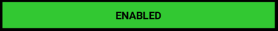
Contained buttons are high-emphasis, distinguished by their use of elevation and fill. They contain actions that are primary to your app.


Functional positive:

Functional negative:


Jetpack Compose
Use the OdsButton composable:
OdsButton(
    text = "Contained button",
    onClick = { doSomething() },
    enabled = true,
    icon = OdsButton.Icon(painterResource(R.drawable.ic_coffee)) // Line can be removed if you don't need any icon
)
To display a primary button or a functional green/red button, you need to pass an OdsButton.Style
through the style parameter:
OdsButton(
    text = "Positive button",
    onClick = { doSomething() },
    enabled = true,
    icon = OdsButton.Icon(painterResource(R.drawable.ic_coffee)), // Line can be removed if you don't need any icon
    style = OdsButton.Style.FunctionalPositive
)
OdsButton API
| Parameter | Default value | Description |
|---|---|---|
text: String |
Text displayed into the button | |
onClick: () -> Unit |
Callback invoked when the button is clicked | |
modifier: Modifier |
Modifier |
Modifier applied to the button |
icon: OdsButton.Icon? |
null |
Icon displayed in the button before the text |
enabled: Boolean |
true |
Controls the enabled state of the button. When false, this button will not be clickable. |
style: OdsButton.Style |
OdsButton.Style.Default |
Style applied to the button. Set it to OdsButton.Style.Primary for an highlighted button style or use OdsButton.Style.FunctionalPositive/ OdsButton.Style.FunctionalNegative for a functional green/red button style. |
XML
In your layout, use the OdsButton view.
Set odsButtonStyle attribute to:
-
primaryfor a primary background color -
functional_positivefor a positive background color -
functional_negativefor a negative background color -
standardfor a default background color
You can also force the button display in light or dark theme using invertedTheme boolean attribute. By default (false value), the appearance applied is based on the system night mode value.
<com.orange.ods.xml.component.button.OdsButton
    android:id="@+id/ods_button"
    android:layout_height="wrap_content"
    android:layout_width="wrap_content"
    app:text="Contained button"
    app:icon="@drawable/ic_coffee"
    app:odsButtonStyle="primary"
    app:invertedTheme="false" />
Text button
Text buttons are typically used for less-pronounced actions, including those located in dialogs and cards. In cards, text buttons help maintain an emphasis on card content.


Jetpack Compose
Use the OdsTextButton composable:
OdsTextButton(
    text = "Text button",
    onClick = { doSomething() },
    enabled = true,
    icon = OdsButton.Icon(painterResource(R.drawable.ic_coffee)), // Line can be removed if you don't need any icon
    style = OdsTextButton.Style.Primary
)
OdsTextButton API
| Parameter | Default value | Description |
|---|---|---|
text: String |
Text displayed into the button | |
onClick: () -> Unit |
Callback invoked on button click | |
modifier: Modifier |
Modifier |
Modifier applied to the button |
icon: OdsButton.Icon? |
null |
Icon displayed in the button before the text |
enabled: Boolean |
true |
Controls the enabled state of the button. When false, this button will not be clickable. |
style: OdsTextButton.Style |
OdsTextButton.Style.Default |
Style applied to the button. By default onSurface color is used for text color. Use OdsTextButton.Style.Primary for an highlighted text color. |
XML
In your layout, use the OdsTextButton view.
Set odsTextButtonStyle attribute to:
-
primaryfor a primary colored text button -
standardfor a default colored text button
You can also force the button display in light or dark theme using invertedTheme boolean attribute. By default (false value), the appearance applied is based on the system night mode value.
<com.orange.ods.xml.component.button.OdsTextButton
    android:id="@+id/ods_text_button"
    android:layout_height="wrap_content"
    android:layout_width="wrap_content"
    app:text="Text button"
    app:icon="@drawable/ic_coffee"
    app:odsTextButtonStyle="primary"
    app:invertedTheme="true" />
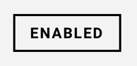
Outlined button
Outlined buttons are medium-emphasis buttons. They contain actions that are important, but aren’t the primary action in an app.

Jetpack Compose
Use the OdsOutlinedButton composable:
OdsOutlinedButton(
    text = "Outlined button",
    onClick = {},
    enabled = true,
    icon = OdsButton.Icon(painterResource(R.drawable.ic_coffee)) // Line can be removed if you don't need any icon
)
OdsOutlinedButton API
| Parameter | Default value | Description |
|---|---|---|
text: String |
Text displayed into the button | |
onClick: () -> Unit |
Callback invoked on button click | |
modifier: Modifier |
Modifier |
Modifier applied to the button |
icon: OdsButton.Icon? |
null |
Icon displayed in the button before the text |
enabled: Boolean |
true |
Controls the enabled state of the button. When false, the button is not clickable. |
XML
In your layout, use the OdsOutlinedButton view.
You can also force the button display in light or dark theme using invertedTheme boolean attribute. By default (false value), the appearance applied is based on the system night mode value.
<com.orange.ods.xml.component.button.OdsOutlinedButton
    android:id="@+id/ods_outlined_button"
    android:layout_height="wrap_content"
    android:layout_width="wrap_content"
    app:text="Outlined button"
    app:icon="@drawable/ic_coffee"
    app:invertedTheme="false" />
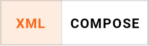
Text toggle buttons group
A group of text toggle buttons. Only one option in a group of toggle buttons can be selected and active at a time. Selecting one option deselects any other.

Jetpack Compose
Use the OdsTextToggleButtonsRow composable:
OdsTextToggleButtonsRow(
    selectedTextButtonIndex = 0,
    textButtons = listOf(
        OdsTextToggleButtonsRow.TextButton(
            "XML",
            { doSomething() }, // Do something like changing selectedTextButtonIndex to refresh composable with new selection
            true
        ),
        OdsTextToggleButtonsRow.TextButton(
            "COMPOSE",
            { doSomething() }, // Do something like changing selectedTextButtonIndex to refresh composable with new selection
            true
        ),
    ),
    sameItemsWeight = false
)
OdsTextToggleButtonsRow API
| Parameter | Default value | Description |
|---|---|---|
selectedTextButtonIndex: Int |
The index of the currently selected text button. | |
textButtons: List<OdsTextToggleButtonsRow.TextButton> |
List of [OdsTextToggleButtonsRow.TextButton] displayed into the toggle group. | |
modifier: Modifier |
Modifier |
Modifier applied to the toggle buttons row |
sameItemsWeight: Boolean |
false |
Controls the place occupied by each item. When true, same weight of importance will be applied to each item, they will occupy the same width. |
Icon button
An icon button is a clickable icon, used to represent actions. This component is typically used inside an App Bar for the navigation icon / actions.
Jetpack Compose
Use the OdsIconButton composable:
OdsIconButton(
    icon = OdsIconButton.Icon(
        painterResource(id = R.drawable.ic_ui_light_mode),
        stringResource(id = R.string.theme_changer_icon_content_description_light)
    ),
    onClick = { doSomething() },
)
OdsIconButton API
| Parameter | Default value | Description |
|---|---|---|
icon: OdsIconButton.Icon |
Icon to be drawn into the button | |
onClick: () -> Unit |
Callback to be invoked when the button is clicked | |
modifier: Modifier |
Modifier |
Modifier to be applied to the button |
enabled: Boolean |
true |
Controls the enabled state of the button. When false, this button will not be clickable. |
XML
In your layout, use the OdsIconButton view.
You can also force the icon button display in light or dark theme using invertedTheme boolean attribute. By default (false value), the appearance applied is based on the system night mode value.
<com.orange.ods.xml.component.button.OdsIconButton
    android:id="@+id/ods_icon_button"
    android:layout_height="wrap_content"
    android:layout_width="wrap_content"
    app:icon="@drawable/ic_coffee"
    app:iconContentDescription="Coffee"
    app:invertedTheme="true" />
Icon toggle button
An icon button with two states, for icons that can be toggled ‘on’ and ‘off’, such as a bookmark icon, or a navigation icon that opens a drawer.
Jetpack Compose
Use the OdsIconToggleButton composable:
OdsIconToggleButton(
    checked = false,
    onCheckedChange = { doSomething() },
    uncheckedIcon = OdsIconButton.Icon(
        painterResource(R.drawable.ic_heart_outlined),
        "Add to favorites"
    ),
    checkedIcon = OdsIconButton.Icon(painterResource(R.drawable.ic_heart), "Remove from favorites")
)
OdsIconToggleButton API
| Parameter | Default value | Description |
|---|---|---|
checked: Boolean |
Controls the checked state of the button | |
onCheckedChange: (Boolean) -> Unit |
Callback invoked when the button is checked | |
uncheckedIcon: OdsIconButton.Icon |
Icon displayed when the button is unchecked | |
checkedIcon: OdsIconButton.Icon |
Icon displayed when the button is checked | |
modifier: Modifier |
Modifier |
Modifier applied to the button |
enabled: Boolean |
true |
Controls the enabled state of the button. When false, this button will not be clickable. |
XML
In your layout, use the OdsIconToggleButton view.
You can also force the icon toggle button display in light or dark theme using invertedTheme boolean attribute. By default (false value), the appearance applied is based on the system night mode value.
<com.orange.ods.xml.component.button.OdsIconToggleButton
    android:id="@+id/ods_icon_toggle_button"
    android:layout_height="wrap_content"
    android:layout_width="wrap_content"
    app:checked="true"
    app:checkedIcon="@drawable/ic_eye"
    app:checkedIconContentDescription="Password visible"
    app:uncheckedIcon="@drawable/ic_crossed_eye"
    app:uncheckedIconContentDescription="Password invisible"
    app:invertedTheme="false" />
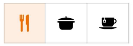
Icon toggle buttons group
A group of toggle buttons. Only one option in a group of toggle buttons can be selected and active at a time. Selecting one option deselects any other.
Jetpack Compose
Use the OdsIconToggleButtonsRow composable:
OdsIconToggleButtonsRow(
    selectedIconButtonIndex = 0,
    iconButtons = listOf(
        OdsIconToggleButtonsRow.IconButton(
            painterResource(id = R.drawable.ic_restaurant),
            "Restaurant",
            { doSomething() } // Do something like changing selectedIconButtonIndex to refresh composable with new selection
        ),
        OdsIconToggleButtonsRow.IconButton(
            painterResource(id = R.drawable.ic_cooking_pot),
            "Cooking pot",
            { doSomething() } // Do something like changing selectedIconButtonIndex to refresh composable with new selection
        ),
        OdsIconToggleButtonsRow.IconButton(
            painterResource(id = R.drawable.ic_coffee),
            "Coffee",
            { doSomething() }, // Do something like changing selectedIconButtonIndex to refresh composable with new selection
            enabled = false
        )
    )
)
OdsIconToggleButtonsRow API
| Parameter | Default value | Description |
|---|---|---|
selectedIconButtonIndex: Int |
The index of the currently selected icon button. | |
iconButtons: List<OdsIconToggleButtonsRow.IconButton> |
List of [OdsIconToggleButtonsRow.IconButton] displayed into the toggle group. | |
modifier: Modifier |
Modifier |
Modifier applied to the toggle buttons group |
XML
In your layout, use the OdsIconToggleButtonsRow view.
You can also force the icon toggle buttons row display in light or dark theme using invertedTheme boolean attribute. By default (false value), the appearance applied is based on the system night mode value.
<com.orange.ods.xml.component.button.OdsIconToggleButtonsRow
    android:id="@+id/ods_icon_toggle_buttons_row"
    android:layout_height="wrap_content"
    android:layout_width="wrap_content"
    app:selectedIconButtonIndex="1"
    app:invertedTheme="false" />
Add the icons in the OdsIconToggleButtonsRow by code using view binding:
binding.odsIconToggleButtonsRow.icons = listOf(
    OdsIconToggleButtonsRow.IconButton(
        painter = painterResource(id = R.drawable.ic_cooking_pot),
        contentDescription = "Cooking pot",
        onClick = { doSomething() } // Do something like changing selectedIconButtonIndex to refresh composable with new selection
    ),
    OdsIconToggleButtonsRow.IconButton(
        painter = painterResource(id = R.drawable.ic_coffee),
        contentDescription = "Coffee",
        onClick = { doSomething() } // Do something like changing selectedIconButtonIndex to refresh composable with new selection
    )
)