Radio buttons
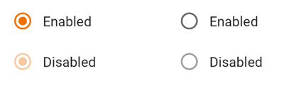
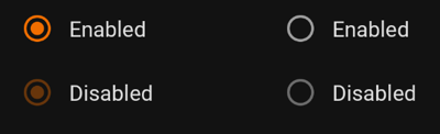
Radio button selection control allows the user to select options.
Use radio buttons to:
- Select a single option from a list
- Expose all available options
- If available options can be collapsed, consider using a dropdown menu instead, as it uses less space.
On this page
Specifications references
Accessibility
Please follow accessibility criteria for development.
Radio buttons support content labeling for accessibility and are readable by most screen readers, such as TalkBack. Text rendered in radio buttons is automatically provided to accessibility services. Additional content labels are usually unnecessary.
Implementation
Jetpack Compose
In your composable screen you can use:
OdsRadioButton(
    selected = true,
    onClick = { doSomething() },
    enabled = true
)
OdsRadioButton API
| Parameter | Default value | Description |
|---|---|---|
selected: Boolean |
Controls the selected state of the radio button | |
onClick: (() -> Unit)? |
Callback invoked on radio button click. If null, then the radio button will not handle input events, and only act as a visual indicator of selected state. |
|
modifier: Modifier |
Modifier |
Modifier applied to the radio button |
enabled: Boolean |
true |
Controls the enabled state of the radio button. When false, the button will not be selectable and appears disabled. |