Menus
Menus appear from a button, action, or other control. It contains at least 2 items that can affect the app, the view or elements within the view.
On this page
Specifications references
Accessibility
Please follow accessibility criteria for development.
The icons which can be displayed in a dropdown menu are always associated to a text so they don’t need a content description.
Variants
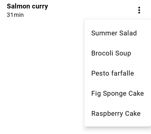
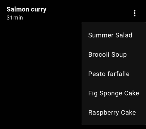
Dropdown menu
A dropdown menu is a compact way of displaying multiple choices. It appears upon interaction with an element (such as an icon or button) or when users perform a specific action.
Jetpack Compose
The library offers an OdsDropdownMenu container composable in which you can add OdsDropdownMenu.Item or OdsDivider as shown in the following example:
var menuExpanded by remember { mutableStateOf(false) }

OdsDropdownMenu(
    expanded = menuExpanded,
    onDismissRequest = { menuExpanded = false },
    offset = DpOffset(x = (-100).dp, y = (-10).dp),
    items = listOf(
        OdsDropdownMenu.Item(
            text = "Summer salad",
            icon = painterResource(id = R.drawable.ic_salad),
            divider = true, // Allow to add a divider between the 2 items
            onClick = { doSomething() }
        ),
        OdsDropdownMenu.Item(
            text = "Brocoli soup",
            icon = painterResource(id = R.drawable.ic_soup),
            onClick = { doSomething() }
        )
    )
)
OdsDropdownMenu API
| Parameter | Default value | Description |
|---|---|---|
items: List<OdsDropdownMenu.Item> |
Items displayed into the dropdown menu | |
expanded: Boolean |
Controls whether the menu is currently open and visible to the user | |
onDismissRequest: () -> Unit |
Callback invoked when the user requests to dismiss the menu, such as by tapping outside the menu’s bounds | |
modifier: Modifier |
Modifier |
Modifier applied to the dropdown menu |
offset: DpOffset |
DpOffset(0.dp, 0.dp) |
Offset added to the menu position |
properties: PopupProperties |
PopupProperties(focusable = true) |
Properties for further customization of the popup’s behavior |
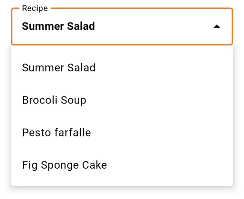
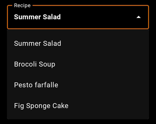
Exposed dropdown menu
Exposed dropdown menus display the currently selected menu item above the menu. This is a combination of a text field and a menu.
Jetpack Compose
To display an exposed dropdown menu, you can use the OdsExposedDropdownMenu composable. As shown below, you should provide a list of OdsExposedDropdownMenu.Item corresponding to the items displayed in the menu (with or without icons).
val items = listOf(
    OdsExposedDropdownMenu.Item("Email", android.R.drawable.ic_dialog_email),
    OdsExposedDropdownMenu.Item("Map", android.R.drawable.ic_dialog_map),
    OdsExposedDropdownMenu.Item("Dialer", android.R.drawable.ic_dialog_dialer),
)
val selectedItem = rememberSaveable() { mutableStateOf(items.first()) }

OdsExposedDropdownMenu(
    label = "Dropdown menu label",
    items = items,
    selectedItem = selectedItem,
    onItemSelectionChange = { item ->
        doSomething() // Do something like retrieving the selected item
    },
    enabled = true
)
OdsExposedDropdownMenu API
| Parameter | Default value | Description |
|---|---|---|
label: String |
Label of the exposed menu text field | |
items: List<OdsExposedDropdownMenu.Item> |
Items displayed into the dropdown menu | |
selectedItem: MutableState<OdsExposedDropdownMenu.Item> |
Selected item displayed into the text field | |
onItemSelectionChange: (OdsExposedDropdownMenu.Item) -> Unit |
Callback invoked when a dropdown menu item is selected. It can be used to get the menu value. | |
modifier: Modifier |
Modifier |
Modifier applied to the dropdown menu |
enabled: Boolean |
true |
Controls the enabled state of the dropdown menu. When false, the dropdown menu text field will be neither clickable nor focusable, visually it will appear in the disabled state. |