Tabs
Tabs organize content across different screens, data sets, and other interactions.
On this page
Specifications references
Accessibility
Please follow accessibility criteria for development.
The Android tab components support screen reader descriptions for tabs and badges. While optional, we strongly encourage their use.
Variants
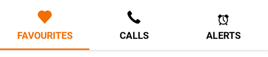
Fixed tabs row
Fixed tabs display all tabs on one screen, with each tab at a fixed width. The width of each tab is determined by dividing the number of tabs by the screen width. They don’t scroll to reveal more tabs; the visible tab set represents the only tabs available.
Jetpack Compose
To display fixed tabs, use OdsTabRow composable and provide a list of OdsTabRow.Tab representing the tabs to display.
You can change tab icon position with tabIconPosition parameter.

OdsTabRow(
    selectedTabIndex = 0,
    tabs = listOf(
        OdsTabRow.Tab(
            painter = OdsTabRow.Tab.Icon(painterResource(id = R.drawable.ic_heart)),
            text = "Favourites",
            onClick = { doSomething() }
        ),
        OdsTabRow.Tab(
            painter = OdsTabRow.Tab.Icon(painterResource(id = R.drawable.ic_call)),
            text = "Calls",
            onClick = { doSomething() }
        )
    )
)
OdsTabRow API
| Parameter | Default value | Description |
|---|---|---|
selectedTabIndex: Int |
Index of the currently selected tab | |
tabs: List<OdsTabRow.Tab> |
List of the OdsTabRow.Tab displayed inside this tabs row |
|
modifier: Modifier |
Modifier |
Modifier applied to the tabs row |
tabIconPosition: OdsTabRow.Tab.Icon.Position |
OdsTabRow.Tab.Icon.Position.Top |
Controls the position of the icon in the tabs. By default, the icon is displayed above the text. |
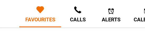
Scrollable tabs row
Scrollable tabs are displayed without fixed widths. They are scrollable, such that some tabs will remain off-screen until scrolled.
Jetpack Compose
To display scrollable tabs, use OdsScrollableTabRow composable. This is the only difference with fixed tabs implementation.
As for fixed tabs, you can change tab icon position with tabIconPosition parameter.
OdsScrollableTabRow(
    selectedTabIndex = 0,
    tabs = listOf(
        OdsTabRow.Tab(
            painter = OdsTabRow.Tab.Icon(painterResource(id = R.drawable.ic_heart)),
            text = "Favourites",
            onClick = { doSomething() }
        ),
        OdsTabRow.Tab(
            painter = OdsTabRow.Tab.Icon(painterResource(id = R.drawable.ic_call)),
            text = "Calls",
            onClick = { doSomething() }
        )
    )
)
OdsScrollableTabRow API
| Parameter | Default value | Description |
|---|---|---|
selectedTabIndex: Int |
Index of the currently selected tab | |
tabs: List<OdsTabRow.Tab> |
List of the OdsTabRow.Tab displayed inside this tabs row |
|
modifier: Modifier |
Modifier |
Modifier applied to the tabs row |
tabIconPosition: OdsTabRow.Tab.Icon.Position |
OdsTabRow.Tab.Icon.Position.Top |
Controls the position of the icon in the tabs. By default, the icon is displayed above the text. |