List items
Lists are continuous, vertical indexes of text or images.
On this page
Specifications references
Accessibility
Please follow accessibility criteria for development.
Variants
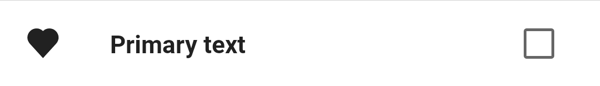
Single-line list
There are multiple display possibilities for a single-line list, where leading can optionally be an icon, a circular, a square or a wide image.
Here are two examples:
-
with a wide image and a checkbox


-
with a standard icon and a checkbox

Please note that there is no start padding with wide images.
Jetpack Compose
The library offers the OdsListItem composable to display lists items.
The OdsListItem composable allows you to display a leading icon using the leadingIcon parameter of the OdsListItem method, as well as a trailing element (either a checkbox, a switch, a radio button, an icon or a caption text) using the trailing parameter.
OdsListItem(
    modifier = Modifier.clickable { doSomething() },
    text = "Primary text",
    leadingIcon = OdsListItem.LeadingIcon(
        OdsListItem.leadingIcon.Type.Icon,
        painterResource(id = R.drawable.ic_heart),
        "Heart"
    ),
    trailing = OdsListItem.TrailingCheckbox(checked) { checked != checked },
    divider = true
)
OdsListItem API
| Parameter | Default value | Description |
|---|---|---|
text: String |
The primary text of the list item | |
modifier: Modifier |
Modifier |
Modifier to be applied to the list item |
leadingIcon: OdsListItem.LeadingIcon? |
null |
The leading supporting visual of the list item |
secondaryText: String? |
null |
The secondary text of the list item |
secondaryTextLineCount: OdsListItem.SecondaryTextLineCount |
OdsListItem.SecondaryTextLineCount.One |
Indicates the lines number for the secondary text. If longer, it will be truncated. |
overlineText: String? |
null |
The text displayed above the primary text |
trailing: OdsListItem.Trailing? |
null |
The trailing content to display at the end of the list item |
divider: Boolean |
false |
Whether or not a divider is displayed at the bottom of the list item |
onClick: (() -> Unit)? |
null |
Will be called when the user clicks the list item. This parameter only has an effect if trailing is OdsListItem.TrailingIcon or null. |
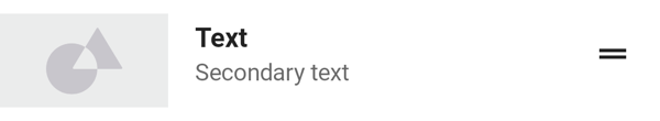
Two-line list
Like single-line list, two-line list leading can optionally be an icon, a circular, a square or a wide image.
Here are two examples:
-
with a wide image and a checkbox

-
with a standard icon and a checkbox


Jetpack Compose
The only difference with the single-line implementation is that the secondaryText property of OdsListItem is not null.
OdsListItem(
    modifier = Modifier.clickable { doSomething() },
    text = "Primary text",
    secondaryText = "Secondary text",
    leadingIcon = OdsListItem.LeadingIcon(
        OdsListItem.LeadingIcon.Type.CircularImage,
        painterResource(id = R.drawable.placeholder, "")
    ),
    trailing = OdsListItem.TrailingIcon(
        painterResource(id = R.drawable.ic_drag_handle),
        "Drag item"
    ),
    divider = true
)
Use OdsListItem API.
Three-line list
Like single-line list, three-line list leading can optionally be an icon, a circular, a square or a wide image.
Here are two examples:
-
with a wide image and a checkbox


-
with a standard icon and a checkbox


Jetpack Compose
The only difference with the two-line implementation is that the secondaryTextLineCount property of OdsListItem is set to OdsListItem.SecondaryTextLineCount.Two.
OdsListItem(
    modifier = Modifier.clickable { doSomething() },
    text = "Primary text",
    secondaryText = "Lorem ipsum dolor sit amet, consectetur adipiscing elit, sed do eiusmod tempor.",
    secondaryTextLineCount = OdsListItem.SecondaryTextLineCount.Two,
    leadingIcon = OdsListItem.LeadingIcon(
        OdsListItem.LeadingIcon.Type.SquareImage,
        painter = painterResource(id = R.drawable.placeholder),
        ""
    ),
    trailing = OdsListItem.TrailingCaption("Caption"),
    divider = true
)
Use OdsListItem API.