Text fields
Text fields let users enter and edit text.
On this page
Specifications references
Accessibility
Please follow accessibility criteria for development.
Android’s text field component APIs support both label text and helper text for informing the user as to what information is requested for a text field.
Variants
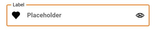
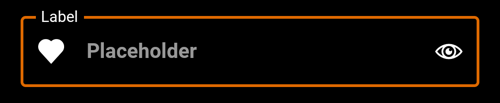
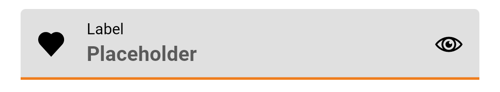
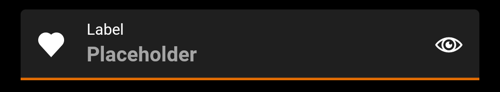
Text field #
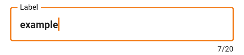
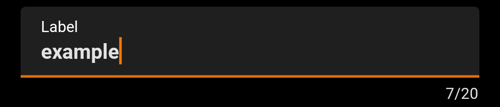
A text field can be filled or outlined.
The outlined version is more accessible in term of contrast. This is the reason why Orange text fields are outlined.
Jetpack Compose
To add a text field in your composable screen you can use the OdsTextField composable as follow:
var text by rememberSaveable { mutableStateOf("") }
OdsTextField(
    leadingIcon = OdsTextField.LeadingIcon(
        painterResource(id = R.drawable.ic_heart),
        "Like"
    ) { doSomething() },
    trailing = OdsTextField.TrailingText(text = "units"), // It can be one of the provided `OdsTextField.Trailing`. See more information below.
    enabled = true,
    readOnly = false,
    isError = false,
    errorMessage = "Error message",
    value = text,
    onValueChange = { text = it },
    label = "Label",
    placeholder = "Placeholder",
    visualTransformation = VisualTransformation.None,
    keyboardOptions = KeyboardOptions.Default,
    keyboardActions = KeyboardActions(),
    singleLine = false,
    maxLines = Int.MAX_VALUE,
    characterCounter = OdsTextFieldCharacterCounter(
        characterCount = characterCount,
        maxCharacterCount = 20,
        enabled = true
    )
)
The library provides several OdsTextField.Trailing that you can use as trailing element for text field:
-
OdsTextField.TrailingIcon: Displays an icon as trailing element -
OdsTextField.TrailingText: Displays a text as trailing element
Note: You will find more information about the character counter in Extras
OdsTextField API #
| Parameter | Default value | Description |
|---|---|---|
value: String |
Input text to be shown in the text field | |
onValueChange: (String) -> Unit |
Callback that is triggered when the input service updates the text. An updated text comes as a parameter of the callback. | |
modifier: Modifier |
Modifier |
Modifier applied to this text field |
trailing: OdsTextField.Trailing? |
null |
Trailing element to display at the end of the text field |
enabled: Boolean |
true |
Controls the enabled state of the text field. When false, the text field will be neither editable nor focusable, the input of the text field will not be selectable, visually text field will appear in the disabled UI state. |
readOnly: Boolean |
false |
Controls the editable state of the text field. When true, the text field can not be modified, however, a user can focus it and copy text from it. Read-only text fields are usually used to display pre-filled forms that user can not edit. |
label: String? |
null |
Label to be displayed inside or outside the text field. The default text style used is OdsTypography.bodyS when the text field is in focus and OdsTypography.titleM when the text field is not in focus. |
placeholder: String? |
null |
Placeholder to be displayed when the text field is in focus and the input text is empty. The default text style for internal Text is OdsTypography.titleM. |
leadingIcon: OdsTextField.LeadingIcon? |
null |
Icon displayed at the beginning of the text field container |
isError: Boolean |
false |
Indicates if the text field’s current value is in error state. If set to true, the text field outline and the error message will be displayed in error color. |
errorMessage: String? |
null |
Message displayed below the text field when it is in error |
visualTransformation: VisualTransformation |
VisualTransformation.None |
Transforms the visual representation of the input value. For example, you can use PasswordVisualTransformation to create a password text field. By default no visual transformation is applied. |
keyboardOptions: KeyboardOptions |
KeyboardOptions.Default |
Software keyboard options that contains configuration such as KeyboardType and ImeAction
|
keyboardActions: KeyboardActions |
KeyboardActions() |
When the input service emits an IME action, the corresponding callback is called. Note that this IME action may be different from what you specified in KeyboardOptions.imeAction. |
singleLine: Boolean |
false |
When set to true, this text field becomes a single horizontally scrolling text field instead of wrapping onto multiple lines. The keyboard will be informed to not show the return key as the ImeAction. Note that maxLines parameter will be ignored as the maxLines attribute will be automatically set to 1. |
maxLines: Int |
Int.MAX_VALUE |
Maximum number of visible lines. Should be equal or greater than 1. Note that this parameter will be ignored and instead maxLines will be set to 1 if singleLine is set to true. |
characterCounter: OdsTextFieldCharacterCounter?
|
null |
Character counter displayed below the text field |
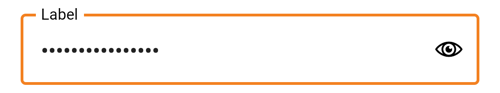
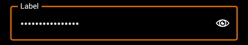
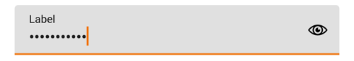
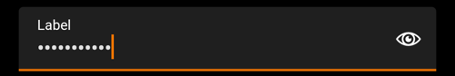
Password text field #
Password text field is a text field implementation that includes password visual transformation and optional visualisation icon.
Jetpack Compose
To add a password text field in your composable screen you can use the OdsPasswordTextField composable as follow:
var text by rememberSaveable { mutableStateOf("") }
OdsPasswordTextField(
    enabled = true,
    readOnly = false,
    isError = false,
    errorMessage = "Error message",
    value = text,
    onValueChange = { text = it },
    label = "Label",
    placeholder = "Placeholder",
    visualisationIcon = true,
    keyboardOptions = KeyboardOptions.Default,
    keyboardActions = KeyboardActions(),
    characterCounter = OdsTextFieldCharacterCounter(
        characterCount = characterCount,
        maxCharacterCount = TextFieldMaxCharacterCount,
        enabled = enabled
    )
)
Note: This composable relies on OdsTextField in order to keep homogeneity in each application.
Its appearance (outlined or filled) is inherited from text fields style configuration.
See text field section if you want to change it in your custom theme.
OdsPasswordTextField API #
| Parameter | Default value | Description |
|---|---|---|
value: String |
Input text to be shown in the text field | |
onValueChange: (String) -> Unit |
Callback that is triggered when the input service updates the text. An updated text comes as a parameter of the callback. | |
modifier: Modifier |
Modifier |
Modifier applied to this text field |
enabled: Boolean |
true |
Controls the enabled state of the text field. When false, the text field will be neither editable nor focusable, the input of the text field will not be selectable, visually text field will appear in the disabled UI state. |
readOnly: Boolean |
false |
Controls the editable state of the text field. When true, the text field can not be modified, however, a user can focus it and copy text from it. Read-only text fields are usually used to display pre-filled forms that user can not edit. |
label: String? |
null |
Label to be displayed inside or outside the text field. The default text style used is OdsTypography.bodyS when the text field is in focus and OdsTypography.titleM when the text field is not in focus. |
placeholder: String? |
null |
Placeholder to be displayed when the text field is in focus and the input text is empty. The default text style for internal Text is OdsTypography.titleM. |
visualisationIcon: Boolean |
true |
Controls the display of the eye icon to allow showing/hiding password |
isError: Boolean |
false |
Indicates if the text field’s current value is in error state. If set to true, the text field outline and the error message will be displayed in error color. |
errorMessage: String? |
null |
Message displayed below the text field when it is in error |
keyboardOptions: KeyboardOptions |
KeyboardOptions.Default |
Software keyboard options that contains configuration such as KeyboardType and ImeAction
|
keyboardActions: KeyboardActions |
KeyboardActions() |
When the input service emits an IME action, the corresponding callback is called. Note that this IME action may be different from what you specified in KeyboardOptions.imeAction. |
characterCounter: OdsTextFieldCharacterCounter?
|
null |
Character counter displayed below the text field |
Extras
Character counter #
Jetpack Compose
In each TextField component, you can use the characterCounter parameter to add a character counter if there is a restriction on the number of characters in a field.
It will be placed properly below the text field, end aligned.
Use the OdsTextFieldCharacterCounter class for this behavior as shown below:
OdsTextFieldCharacterCounter(
    modifier = Modifier.align(Alignment.End),
    characterCount = characterCount,
    maxCharacterCount = 20,
    enabled = true
)
Be careful, the limitation behavior should be managed by yourself in the onValueChange method of the text field:
if (text.length <= TextFieldMaxCharacterCount) {
    value = text
}
OdsTextFieldCharacterCounter #
| Parameter | Default value | Description |
|---|---|---|
characterCount: Int |
Text field current characters count. | |
maxCharacterCount: Int |
Maximum number of characters to display in the counter. Note: the limitation behavior should be managed by yourself in the onValueChange method of the text field. |
|
enabled: Boolean |
true |
Controls the enable state of the counter. If set to false the text will be displayed in disabled color. |
Custom theme configuration
You can override the default display of text fields in your custom theme by overriding the textFieldStyle attribute as below:
override val components: OdsComponentsConfiguration
    get() = object : OdsComponentsConfiguration() {
        override val textFieldStyle: ComponentStyle
            get() = ComponentStyle.Filled
    }