Progress indicators
Progress indicators express an unspecified wait time or display the length of a process.
On this page
Specifications references
Accessibility
Please follow accessibility criteria for development.
Variants
Progress bar
Progress bars, also called linear progress indicators, display progress by animating an indicator along the length of a fixed, visible track. The behavior of the indicator is dependent on whether the progress of a process is known.
Linear progress indicators support both determinate and indeterminate operations.
- Determinate operations display the indicator increasing in width from 0 to 100% of the track, in sync with the process’s progress.
-
Indeterminate operations display the indicator continually growing and shrinking along the track until the process is complete.
Jetpack Compose
You can use the composable OdsLinearProgressIndicator like this:
For a determinate linear progress indicator, provide the progress value:
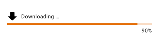
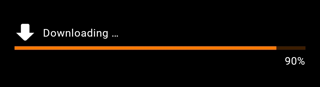
OdsLinearProgressIndicator(
    progress = 0.9f,
    label = "Downloading ...",
    icon = OdsLinearProgressIndicator(
        painterResource(id = R.drawable.ic_arrow_down),
        ""
    ),
    showCurrentValue = true
)
For an indeterminate linear progress indicator, no need to provide a progress value:
OdsLinearProgressIndicator(
    label = "Downloading ...",
    icon = OdsLinearProgressIndicator(
        painterResource(id = R.drawable.ic_arrow_down),
        ""
    )
)
OdsLinearProgressIndicator API
| Parameter | Default value | Description |
|---|---|---|
modifier: Modifier |
Modifier |
Modifier applied to the progress indicator |
progress: Float? |
null |
Progress indicator value where 0.0 represents no progress and 1.0 represents full progress. Values outside of this range are coerced into the range. If set to null, the progress indicator is indeterminate. |
label: String? |
null |
Label displayed above the linear progress |
icon: OdsLinearProgressIndicator.Icon? |
null |
Icon displayed above the progress indicator |
showCurrentValue: Boolean |
false |
Controls the progress indicator current value visibility which is displayed in percent below the progress bar |
Activity indicator
Activity indicators, also called circular progress indicators, display progress by animating an indicator along an invisible circular track in a clockwise direction. They can be applied directly to a surface, such as a button or card.
Circular progress indicators support both determinate and indeterminate processes.
- Determinate circular indicators fill the invisible, circular track with color, as the indicator moves from 0 to 360 degrees.
- Indeterminate circular indicators grow and shrink in size while moving along the invisible track.


Jetpack Compose
You can use the OdsCircularProgressIndicator composable like this:
- For a determinate circular progress indicator, provide the progress value:
OdsCircularProgressIndicator(
    progress = 0.9f,
    label = "Downloading ..."
)
- For an indeterminate circular progress indicator, no need to provide a progress value:
OdsCircularProgressIndicator(
    label = "Downloading ..."
)
OdsCircularProgressIndicator API
| Parameter | Default value | Description |
|---|---|---|
modifier: Modifier |
Modifier |
Modifier applied to the progress indicator |
progress: Float? |
null |
Progress indicator value where 0.0 represents no progress and 1.0 represents full progress. Values outside of this range are coerced into the range. If set to null, the progress indicator is indeterminate. |
label: String? |
null |
Label displayed below the circular progress |