Floating action buttons
A floating action button (FAB) represents the primary action of a screen.
On this page
Specifications references
Accessibility
Please follow accessibility criteria for development.
The OdsFloatingActionButton.Icon used in Floating Action Buttons APIs force the developers to set a content description to the FABs so that
screen readers like TalkBack are able to announce their purpose or action.
Text rendered in an extended FAB is automatically provided to accessibility services, so additional content labels are usually unnecessary.
In this context you can set an empty contentDescription.
Variants
Regular FAB
Regular FABs are FABs that are not expanded and are a regular size.


Jetpack Compose
To display a regular Floating Action Button in your composable screen, use OdsFloatingActionButton:
OdsFloatingActionButton(
    onClick = { doSomething() },
    mini = false,
    icon = OdsFloatingActionButton.Icon(
        painterResource(id = R.drawable.ic_plus),
        stringResource(id = R.string.add)
    ),
    modifier = modifier
)
OdsFloatingActionButton API
| Parameter | Default value | Description |
|---|---|---|
icon: OdsFloatingActionButton.Icon |
Icon used into the FAB | |
onClick: () -> Unit |
Callback invoked on FAB click | |
modifier: Modifier |
Modifier |
Modifier applied to the FAB |
mini: Boolean |
false |
Controls the size of the FAB. If true, the size of the FAB will be 40dp, otherwise the default size will be used. |
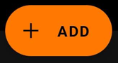
Mini FAB
A mini FAB should be used on smaller screens.
Mini FABs can also be used to create visual continuity with other screen elements.


Jetpack Compose
To display a mini FAB in your composable screen use OdsFloatingActionButton
OdsFloatingActionButton(
    onClick = { doSomething() },
    mini = true,
    icon = OdsFloatingActionButton.Icon(
        painterResource(id = R.drawable.ic_plus),
        stringResource(id = R.string.add)
    ),
    modifier = modifier
)
Use OdsFloatingActionButton API.
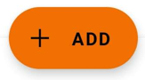
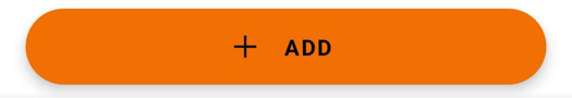
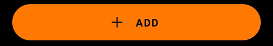
Extended FAB
The extended FAB is wider, and it includes a text label.
Jetpack Compose
To display an extended FAB, use OdsExtendedFloatingActionButton:
OdsExtendedFloatingActionButton(
    onClick = { doSomething() },
    text = stringResource(id = R.string.add),
    icon = OdsFloatingActionButton.Icon(painterResource(id = R.drawable.ic_plus), ""),
    modifier = modifier
)
OdsExtendedFloatingActionButton API
| Parameter | Default value | Description |
|---|---|---|
icon: OdsFloatingActionButton.Icon |
Icon used into the FAB | |
onClick: () -> Unit |
Callback invoked on FAB click | |
text: String |
Text displayed into the FAB | |
modifier: Modifier |
Modifier |
Modifier applied to the FAB |