Buttons
Buttons allow users to take actions, and make choices, with a single tap.
Page Summary
Specifications references
- Design System Manager - Buttons
- Material Design - Buttons
- Technical documentation soon available
Accessibility
Please follow accessibility criteria for development
Buttons support content labeling for accessibility and are readable by most screen readers, such as TalkBack. Text rendered in buttons is automatically provided to accessibility services. Additional content labels are usually unnecessary.
Variants
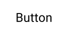
Text button
Text buttons are typically used for less-pronounced actions, including those located in dialogs and cards. In cards, text buttons help maintain an emphasis on card content.
Flutter implementation
Use the OdsTextButton:
return OdsTextButton(
  text: "Text button",
  onClick: () {},
  icon: SvgPicture.asset("assets/ic_profile.svg", // Optional, line can be removed if you don't need any icon
);
To display a primary button, you need to pass an OdsTextButtonStyle
through the style parameter:
return OdsTextButton(
  text: "Text button",
  onClick: () {},
  icon: SvgPicture.asset("assets/ic_profile.svg"), // Optional, line can be removed if you don't need any icon
  style: OdsTextButtonStyle.functionalPrimary
);
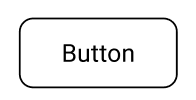
Outlined button
Outlined buttons are medium-emphasis buttons. They contain actions that are important, but aren’t the primary action in an app.
Flutter implementation
Use the OdsOutlinedButton composable:
return OdsOutlinedButton(
  text: "Outlined button",
  onClick: () {},
  icon: SvgPicture.asset('assets/ic_profile.svg'), // Optional, line can be removed if you don't need any icon
);
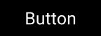
Contained button
Contained buttons are high-emphasis, distinguished by their use of elevation and fill. They contain actions that are primary to your app.
Functional positive:

Functional negative:

Flutter implementation
Use the OdsButton:
return OdsButton(
  text: "Contained button",
  onClick: () {},
  icon: SvgPicture.asset("assets/ic_profile.svg"), // Optional, line can be removed if you don't need any icon
);
To display a primary button or a functional green/red button, you need to pass an OdsButtonStyle
through the style parameter:
return OdsButton(
  text: "Positive button",
  onClick: () {},
  icon: SvgPicture.asset("assets/ic_profile.svg"), // Optional, line can be removed if you don't need any icon
  style: OdsButtonStyle.functionalPositive
);
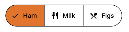
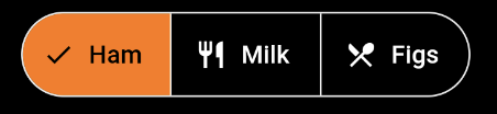
Segmented button
A group of toggle buttons. Only one option in a group of toggle buttons can be selected and active at a time. Selecting one option deselects any other. Use for simple choices between two to five items (for more items or complex choices, use chips)
Flutter implementation
Single-select segmented button :
enum Foods { ham, milk, figs, eggs, oil }

///Single Choice
Foods foodsView = Foods.ham;

return OdsSegmentedButton<Foods>(
        enabled: false, //Optional by default true
        segments: <ButtonSegment<Foods>>[
          ButtonSegment<Foods>(
            value: Foods.ham,
            label: Text("Ham"),
            icon: Icon(Icons.restaurant), // Optional, line can be removed if you don't need any icon
          ),
          ButtonSegment<Foods>(
            value: Foods.milk,
            label: Text("Milk"),
            icon: Icon(Icons.restaurant), // Optional, line can be removed if you don't need any icon
          ),
        ],
        selected: <Foods>{foodsView},
        onSelectionChanged: (Set<Foods> newSelection) {
          setState(
            () {
              foodsView = newSelection.last;
            },
          );
        });
Multi-select segmented button :
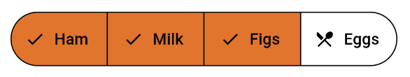
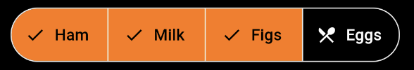
enum Foods { ham, milk, figs, eggs, oil }

///Multi Choice
Set<Foods> selectionMulti = <Foods>{Foods.ham, Foods.milk};

return OdsSegmentedButton<Foods>(
  enabled: false, //Optional by default true
  segments: <ButtonSegment<Foods>>[
    ButtonSegment<Foods>(
      value: Foods.ham,
      label: Text("Ham"),
      icon: Icon(Icons.restaurant), // Optional, line can be removed if you don't need any icon
    ),
    ButtonSegment<Foods>(
      value: Foods.milk,
      label: Text("Milk"),
      icon: Icon(Icons.restaurant), // Optional, line can be removed if you don't need any icon
    ),
  ],
  selected: selectionMulti,
  onSelectionChanged: (Set<Foods> newSelection) {
    setState(() {
      selectionMulti = newSelection;
    });
  },
);
OdsSegmentedButton API
| Parameter | Default value | Description |
|---|---|---|
segments: List<ButtonSegment<T>> segment |
Descriptions of the segments in the button. | |
selected: Set<T> |
The set of ButtonSegment.values that indicate which segments are selected. |
|
onSelectionChanged: (Set<T>)? onSelectionChanged |
null |
Callback invoked on selection change |
enabled: bool? |
true |
Controls the enabled state of the segmented button. When false, this segmented button will not be clickable. |
Button icon
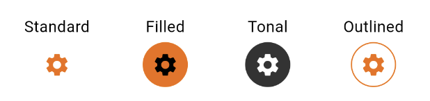
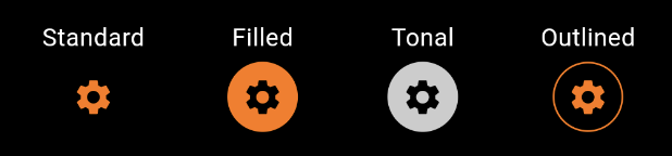
Each icon button has as an optional toggle behavior, which gives the button a selected and unselected state. Toggle buttons remain highlighted when selected, and are styled differently than the default icon buttons.
There are four styles of icon buttons:
- Filled icon button
- Filled tonal icon button
- Outlined icon button
- Standard icon button
Selected
Deselected
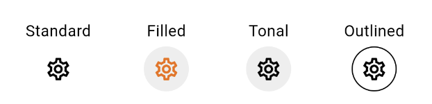
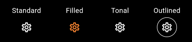
Flutter implementation
The button has a standard style by default. Please add the attribute according to your need :
- Standard : OdsButtonIconStyle.functionalStandard
- Filled : OdsButtonIconStyle.functionalFilled
- Tonal : OdsButtonIconStyle.functionalTonal
- Outlined : OdsButtonIconStyle.functionalOutlined
bool selected = false;

return IconButton(
  icon: Icon(Icons.settings_outlined),
  selectedIcon: const Icon(Icons.settings), // Optional
  style: OdsButtonIconStyle.functionalStandard, // Optional by default OdsButtonIconStyle.functionalStandard
  isSelected: selected,
  isEnabled: true, // Optional by default true
  onClick: () {
    setState(() {
      selected = !selected;
    });
  },
),
OdsButtonIcon API
| Parameter | Default value | Description |
|---|---|---|
icon: Widget |
The icon to display inside the button. | |
selectedIcon: Widget? |
null |
The icon to display inside the button when isSelected is true. |
isSelected: bool |
false |
The optional selection state of the icon button. |
isEnabled: bool |
true |
The optional selection state enabled/disabled of the icon button. |
onClick: void Function()? |
null |
The action to be executed when the button is pressed. |
style: OdsButtonIconStyle |
OdsButtonIconStyle.functionalStandard |
The button’s style color. |