Switches
Switch selection control allows the user to select options.
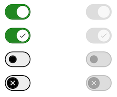
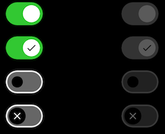
Switches toggle the state of a single setting on or off. They are the preferred way to adjust settings on mobile.
On this page
Specifications references
Accessibility
Please follow accessibility criteria for development.
Switches support content labeling for accessibility and are readable by most screen readers, such as screen reader. Text rendered in switches is automatically provided to accessibility services. Additional content labels are usually unnecessary.
Implementation


Flutter code
In your screen you can use:
return OdsSwitch(
    checked = true,
    onCheckedChange = { },
    icon = true // Optional. False by default
    enabled = true // Optional. True by default
)
OdsSwitch API
| Parameter | Default value | Description |
|---|---|---|
checked: bool |
Controls the checked state of the switch | |
onCheckedChange: (bool?)? Callback |
null |
Callback invoked on switch check. If null, then this is passive and relies entirely on a higher-level component to control the “checked” state. |
icon: bool? |
false |
Icon displayed in the switch button |
enabled: bool? |
true |
Controls the enabled state of the switch. When false, the switch will not be checkable and appears disabled. |