Menus
Menus appear from a button, action, or other control. It contains at least 2 items that can affect the app, the view or elements within the view.
On this page
Specifications references
Accessibility
Please follow accessibility criteria for development.
The icons which can be displayed in a dropdown menu are always associated to a text so they don’t need a content description.
Variants
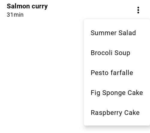
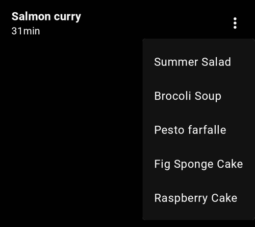
Dropdown menu
A dropdown menu is a compact way of displaying multiple choices. It appears upon interaction with an element (such as an icon or button) or when users perform a specific action.
Flutter Implementation
The library offers an OdsDropdownMenu container composable in which you can add OdsDropdownMenu.Item or OdsDivider as shown in the following example:
return OdsDropdownMenu(
  items: [
    OdsDropdownMenuItem(
      text: "Summer Salad",
      value: "Summer Salad",
      enabled: true, //Optional by default true
      icon: const Icon(Icons.coffee) // Optional
    ),
  ],
    selectedItem: (value) {
    print('$value');
  },
);
OdsDropdownMenu API
| Parameter | Default value | Description |
|---|---|---|
items: List<OdsDropdownMenuItem<String>> |
Items displayed into the dropdown menu | |
selectedItem: Function(T?)? |
Selected item displayed |
OdsDropdownMenuItem API
| Parameter | Default value | Description |
|---|---|---|
text: String |
Typically a Text | |
value: T? |
The value that will be returned by showMenu if this entry is selected. | |
enabled: bool? |
true |
Whether the user is permitted to select this item. |
icon: Widget? |
null |
Typically a single-line ListTile for menus with icons. |
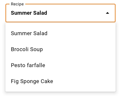
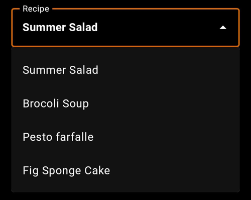
Exposed dropdown menu
Exposed dropdown menus display the currently selected menu item above the menu. This is a combination of a text field and a menu.
Flutter Implementation
To display an exposed dropdown menu, you can use the OdsExposedDropdownMenu composable. As shown below, you should provide a list of OdsExposedDropdownMenu.Item corresponding to the items displayed in the menu (with or without icons).
return OdsExposedDropdownMenu(
  label: "Recipe",
  enabled: true, // Optional by default true
  items: <DropdownMenuEntry<String>>[
    DropdownMenuEntry<String>(
      value: "Summer Salad",
      label: "Summer Salad",
      leadingIcon: const Icon(Icons.coffee), // Optional
    ),
  ],
  selectedItem: (value) {
    setState(() {
      print('$value');
    });
  },
);
OdsExposedDropdownMenu API
| Parameter | Default value | Description |
|---|---|---|
label: String |
Label of the exposed menu text field | |
items: List<DropdownMenuEntry> |
Items displayed into the dropdown menu | |
selectedItem: Function(T?)? |
Selected item displayed into the text field | |
enabled: Boolean |
true |
Controls the enabled state of the dropdown menu. When false, the dropdown menu text field will be neither clickable nor focusable, visually it will appear in the disabled state. |