Progress indicators
Progress indicators express an unspecified wait time or display the length of a process.
Page Summary
Specifications references
- Design System Manager - Progress indicators
- Material Design - Progress indicators
- Technical documentation soon available
Accessibility
Please follow accessibility criteria for development
Variants
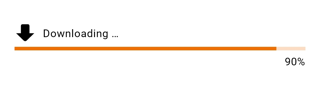
Progress bar
Progress bars, also called linear progress indicators, display progress by animating an indicator along the length of a fixed, visible track. The behavior of the indicator is dependent on whether the progress of a process is known.
Linear progress indicators support both determinate and indeterminate operations.
- Determinate operations display the indicator increasing in width from 0 to 100% of the track, in sync with the process’s progress.
-
Indeterminate operations display the indicator continually growing and shrinking along the track until the process is complete.

Flutter implementation
You can use the composable OdsLinearProgressIndicator like this:
For a determinate linear progress indicator, provide the progress value:
return OdsLinearProgressIndicator(
  progress: 0.9,
  label: 'Downloading ...', // Optional
  icon: const Icon(Icons.download), // Optional
  showCurrentValue: true,
)
For an indeterminate linear progress indicator, no need to provide a progress value:
return OdsLinearProgressIndicator(
            label: 'Downloading ...', // Optional
            icon: const Icon(Icons.download),
);
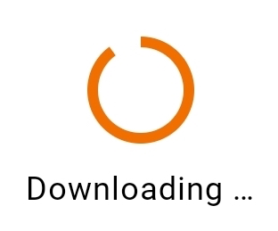
Activity indicator
Activity indicators, also called circular progress indicators, display progress by animating an indicator along an invisible circular track in a clockwise direction. They can be applied directly to a surface, such as a button or card.
Circular progress indicators support both determinate and indeterminate processes.
- Determinate circular indicators fill the invisible, circular track with color, as the indicator moves from 0 to 360 degrees.
- Indeterminate circular indicators grow and shrink in size while moving along the invisible track.

Flutter implementation
You can use the OdsCircularProgressIndicator composable like this:
- For a determinate circular progress indicator, provide the progress value:
return OdsCircularProgressIndicator(
    progress = 0.9,
    label = "Downloading ..." // Optional
)
- For an indeterminate circular progress indicator, no need to provide a progress value:
return OdsCircularProgressIndicator(
    label = "Downloading ..." // Optional
)
Component specific tokens
Soon available