Text fields
Text fields let users enter and edit text.
On this page
Specifications references
Accessibility
Please follow accessibility criteria for development.
Android’s text field component APIs support both label text and helper text for informing the user as to what information is requested for a text field.
Variants
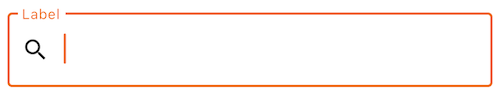
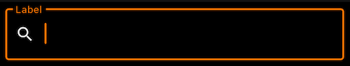
Text field #
A text field can be filled or outlined.
The outlined version is more accessible in term of contrast. This is the reason why Orange text fields are outlined.
Flutter implementation
To add a text field in your composable screen you can use the OdsTextField composable as follow:
final TextEditingController controllerTextField = TextEditingController();

return OdsTextField(
      controller: controllerTextField,
      enabled: true, //Optional by default false
      errorMessage: "Error message",
      keyboardType: TextInputType.text,
      keyboardActions: TextInputAction.done,
      label: "Label",
      trailingIcon: IconButton(
        icon: const Icon(Icons.clear),
        onPressed: () => controllerTextField.clear(),
      ),
      trailingText: "Units",
      leadingIcon: const Icon(Icons.search),
      characterCounter: 20,
      maxLines: 5,
      textCapitalization: true, //Optional by default false
);
The library provides several keyboardActions: TextInputAction that you can use an action the user has requested the text input control to perform
Please follow TextInputAction.
The library provides several keyboardType: TextInputType that you can use type of information for which to optimize the text input control
Please follow TextInputType.
OdsTextField API #
| Parameter | Default value | Description |
|---|---|---|
onValueChange: (String)? -> Void |
Callback that is triggered when the input service updates the text. An updated text comes as a parameter of the callback. | |
trailingIcon: Widget? |
null |
Trailing icon to display at the end of the text field |
trailingText: Widget? |
null |
Trailing text to display at the end of the text field |
enabled: Boolean |
true |
Controls the enabled state of the text field. When false, the text field will be neither editable nor focusable, the input of the text field will not be selectable, visually text field will appear in the disabled UI state. |
readOnly: Boolean |
false |
Controls the editable state of the text field. When true, the text field can not be modified, however, a user can focus it and copy text from it. Read-only text fields are usually used to display pre-filled forms that user can not edit. |
label: String? |
null |
Label to be displayed inside or outside the text field. |
placeholder: String? |
null |
Placeholder to be displayed when the text field is in focus and the input text is empty. |
leadingIcon: Widget? |
null |
Icon displayed at the beginning of the text field container |
errorMessage: String? |
null |
Message displayed below the text field when it is in error. |
keyboardType: TextInputType |
Software keyboard options that contains configuration such as KeyboardType and ImeAction
|
|
keyboardActions: TextInputAction |
When the input service emits an IME action, the corresponding callback is called. | |
maxLines: Int |
null |
Maximum number of visible lines. Should be equal or greater than 1. Note that this parameter will be ignored and instead maxLines will be set to 1 if singleLine is set to true. |
characterCounter: Int? |
null |
Character counter displayed below the text field |
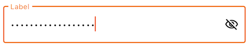
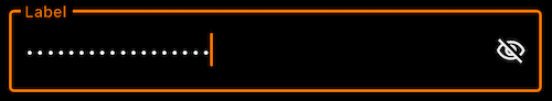
Password text field #
Password text field is a text field implementation that includes password visual transformation and optional visualisation icon.
Flutter implementation
To add a password text field in your composable screen you can use the OdsPasswordTextField composable as follow:
final TextEditingController controllerTextField = TextEditingController();

return OdsPasswordTextField(
    controller: controllerTextField,
    enabled: true, //Optional by default false
    errorMessage: "Error message",
    keyboardType: TextInputType.text,
    keyboardActions: TextInputAction.done,
      label: "Label",
      trailingIcon: IconButton(
        icon: const Icon(Icons.clear),
        onPressed: () => controllerTextField.clear(),
      ),
      trailingText: "Units",
      leadingIcon: const Icon(Icons.search),
      characterCounter: 20,
      textCapitalization: true, //Optional by default false
      visualisationIcon: true,
);
OdsPasswordTextField API #
| Parameter | Default value | Description |
|---|---|---|
onValueChange: (String)? -> Void |
Callback that is triggered when the input service updates the text. An updated text comes as a parameter of the callback. | |
trailingIcon: Widget? |
null |
Trailing icon to display at the end of the text field |
trailingText: Widget? |
null |
Trailing text to display at the end of the text field |
enabled: Boolean |
true |
Controls the enabled state of the text field. When false, the text field will be neither editable nor focusable, the input of the text field will not be selectable, visually text field will appear in the disabled UI state. |
readOnly: Boolean |
false |
Controls the editable state of the text field. When true, the text field can not be modified, however, a user can focus it and copy text from it. Read-only text fields are usually used to display pre-filled forms that user can not edit. |
visualisationIcon: Boolean |
true |
Controls the display of the eye icon to allow showing/hiding password |
label: String? |
null |
Label to be displayed inside or outside the text field. |
placeholder: String? |
null |
Placeholder to be displayed when the text field is in focus and the input text is empty. |
leadingIcon: Widget? |
null |
Icon displayed at the beginning of the text field container |
errorMessage: String? |
null |
Message displayed below the text field when it is in error. |
keyboardType: TextInputType |
Software keyboard options that contains configuration such as KeyboardType and ImeAction
|
|
keyboardActions: TextInputAction |
When the input service emits an IME action, the corresponding callback is called. | |
maxLines: Int |
null |
Maximum number of visible lines. Should be equal or greater than 1. Note that this parameter will be ignored and instead maxLines will be set to 1 if singleLine is set to true. |
characterCounter: Int? |
null |
Character counter displayed below the text field |
Custom theme configuration
Comming soon..