Floating action buttons
A floating action button (FAB) represents the primary action of a screen.
Page Summary
Specifications references
- Design System Manager - Floating Action Button (https://system.design.orange.com/0c1af118d/p/564c73-buttons-fab/b/13aba7)
- Material Design - Buttons: floating action button
- Technical documentation soon available
Accessibility
Please follow accessibility criteria for development
You must define a content description on a FAB via the
semanticsLabel attribute so that screen readers are able to announce their goal or action.
By default the screen reader will say “floating action”.
This does not concern ‘Ods ExtendedFloatingActionButton’ as the text will be localized.
Variants
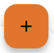
Regular FAB
Regular FABs are FABs that are not expanded and are a regular size.

Flutter implementation
To display a regular Floating Action Button in your composable screen, use OdsFloatingActionButton:
return OdsFloatingActionButton(
  onClick: () {},
  icon: const Icon(Icons.add),
  semanticsLabel: 'Add', //Optional
);
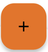
Small FAB
A small FAB should be used on smaller screens.
Small FABs can also be used to create visual continuity with other screen elements.


Flutter implementation
To display a small FAB in your screen use OdsSmallFloatingActionButton
return OdsSmallFloatingActionButton(
  onClick: () {},
  icon: const Icon(Icons.add),
  semanticsLabel: 'Add', //Optional
);
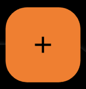
Large FAB
A large FAB should be used on smaller screens.
Small FABs can also be used to create visual continuity with other screen elements.
Flutter implementation
To display a small FAB in your screen use OdsLargeFloatingActionButton
return OdsLargeFloatingActionButton(
  onClick: () {},
  icon: const Icon(Icons.add),
  semanticsLabel: 'Add', //Optional
);
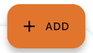
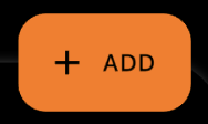
Extended FAB
The extended FAB is wider, and it includes a text label.
Flutter implementation
To display an extended FAB, use OdsExtendedFloatingActionButton:
return OdsSmallFloatingActionButton(
  onClick: () {},
  text = "Add",
  icon: const Icon(Icons.add), //Optional
);
Component specific tokens
Soon available