Dialogs
Dialogs inform users about a task and can contain critical information, require decisions, or involve multiple tasks.
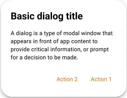
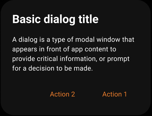
A dialog is a type of modal window that appears in front of app content to provide critical information or ask for a decision. Dialogs disable all app functionality when they appear, and remain on screen until confirmed, dismissed, or a required action has been taken.
Dialogs are purposefully interruptive, so they should be used sparingly.
Page Summary
Specifications references
- Design System Manager - Dialogs
- Material Design - Dialogs
- Technical documentation soon available
Accessibility
Please follow accessibility criteria for development
Variants
Alert dialog
Alert dialogs interrupt users with urgent information, details, or actions.
Flutter implementation
To display an alert dialog in your screen, you can use:
return OdsAlertDialog.openDialog(
  context: context,
  title: "title",
  text: "content text of the dialog",
  confirmButton: OdsAlertDialogButton(
    text: "confirm",
    onClick: () => Navigator.of(context).pop(),
  ),
  dismissButton: OdsAlertDialogButton(
    text: "dismiss",
    onClick: () => Navigator.of(context).pop(),
  ),
);
This component should be used after an event, such as clicking a button. Complete example:
OdsButton(
    text: "Open Dialog",
    style: OdsButtonStyle.functionalPrimary,
        onClick: () => OdsAlertDialog.openDialog(
          context: context,
          title: "title",
          text: "content text of the dialog",
          confirmButton: OdsAlertDialogButton(
            text: "confirm",
            onClick: () => Navigator.of(context).pop(),
          ),
          dismissButton: OdsAlertDialogButton(
            text: "dismiss",
            onClick: () => Navigator.of(context).pop(),
          ),
        ),
    ),
Component specific tokens
Soon available