List items
Lists are continuous, vertical indexes of text or images.
On this page
Specifications references
Accessibility
Soon available
Variants
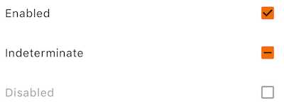
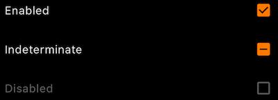
Checkbox list
A ListTile with a Checkbox. In other words, a checkbox with a label. The entire list tile is interactive: tapping anywhere in the tile toggles the checkbox.
Flutter implementation
The library offers the OdsListCheckbox to display lists items.
In your screen you can use OdsListCheckbox :
return OdsListCheckbox(
  title: "Enabled"
  checked: true,
  onCheckedChange: (Options? value) {},
  enabled: true, // Optional. True by default
  indeterminate: true, // Optional. False by default
)
OdsListCheckbox API
| Parameter | Default value | Description |
|---|---|---|
title: String |
The text of the list item | |
checked: bool |
Controls checked state of the checkbox | |
onCheckedChange: (bool?)? Callback |
null |
Callback invoked on checkbox click. If null, then this is passive and relies entirely on a higher-level component to control the checked state. |
enabled: bool? |
true |
Controls enabled state of the checkbox. When false, this checkbox will not be clickable. |
indeterminate: bool? |
false |
Controls enabled state of the checkbox |
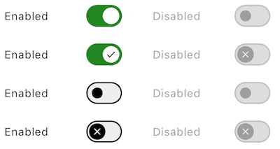
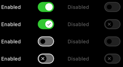
Switch list
A ListTile with a Switch. In other words, a switch button with a label. The entire list tile is interactive: tapping anywhere in the tile toggles the switch button.
Flutter implementation
In your screen you can use:
return OdsListSwitch(
  title: "Enabled",
  checked: true,
  onCheckedChange = { },
  icon: true, // Optional. False by default
  enabled: true, // Optional. True by default
)
OdsListSwitch API
| Parameter | Default value | Description |
|---|---|---|
title: String |
The text of the list item | |
checked: bool |
Controls checked state of the switch | |
onCheckedChange: (bool?)? Callback |
null |
Callback invoked on switch click. If null, then this is passive and relies entirely on a higher-level component to control the checked state. |
icon: bool? |
false |
Icon displayed in the switch button |
enabled: bool? |
true |
Controls enabled state of the checkbox. When false, this switch will not be clickable. |
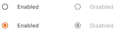
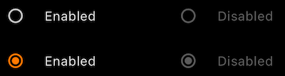
RadioButtons list
A ListTile with a Radio Button. In other words, a radio button with a label. The entire list tile is interactive: tapping anywhere in the tile toggles the radio button.
Flutter implementation
In your screen you can use:
enum Options { option1, option2, option3 }
Options? _selectedOption = Options.option1;

return OdsListRadioButton<Options?>(
  text: "Enabled",
  value: Options.option1,
  groupValue: _selectedOption,
  onCheckedChange: (value) {},
)
OdsListRadioButton API
| Parameter | Default value | Description |
|---|---|---|
text: String? |
The primary content of the list tile | |
value: T |
The value represented by this radio button | |
groupValue: T? |
The currently selected value for a group of radio buttons. | |
onCheckedChange: ((value: T?) -> Callback)? |
null |
Called when the user selects this radio button. The radio button passes [value] as a parameter to this callback. The radio button does not actually change state until the parent widget rebuilds theradio button with the new [groupValue]. If null, the radio button will be displayed as disabled. The provided callback will not be invoked if this radio button is already selected. |
enabled: bool? |
false |
Controls the enabled state of the radio button. When false, this button will not be clickable. |