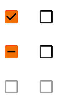
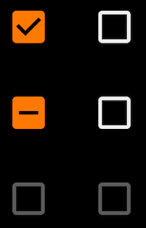
Checkboxes
Checkbox selection control allows the user to select options.
Use checkboxes to:
- Turn an item on or off in a desktop environment
Page Summary
Specifications references
- Design System Manager - Checkboxes
- Material Design - Checkboxes
- Technical documentation soon available
Accessibility
Please follow accessibility criteria for development
Checkboxes support content labeling for accessibility and are readable by most screen readers, such as TalkBack and Voice Over. Text rendered in check boxes is automatically provided to accessibility services. Additional content labels are usually unnecessary.
Implementation


Flutter implementation
In your screen you can use Checkbox :
return OdsCheckbox(
  checked: true,
  onCheckedChange: () {},
  enabled: true,
  indeterminate: true, // Optional. False by default
)
OdsCheckbox API
| Parameter | Default value | Description |
|---|---|---|
checked: bool |
Controls checked state of the checkbox | |
onCheckedChange: (bool?)? Callback |
null |
Callback invoked on checkbox click. If null, then this is passive and relies entirely on a higher-level component to control the checked state. |
enabled: bool |
true |
Controls enabled state of the checkbox. When false, this checkbox will not be clickable. |
indeterminate: bool |
false |
Controls enabled state of the checkbox |