Sliders
Sliders allow users to make selections from a range of values.
Page Summary
- Specifications references
- Accessibility
- Variants
- Continuous slider
- Continuous lockups slider
- Component specific tokens
Specifications references
- Design System Manager - Sliders
- Material Design - Sliders
- Technical documentation soon available
Accessibility
Please follow accessibility criteria for development
Sliders support setting content descriptors for use with screen readers.
Variants
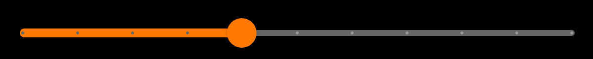
Continuous slider
Continuous sliders allow users to make meaningful selections that don’t require a specific value.


With icons:
In your screen you can use:
return OdsSlider(
  value: 20.0,
);
You can add icons to the continuous slider like this:
return OdsSlider(
  value: 20.0,
  startIcon: Icon(Icons.volume_mute),
  endIcon: Icon(Icons.volume_up),
);
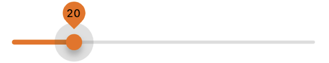
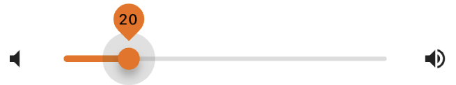
Continuous lockups slider
With icons:
In your screen you can use:
return OdsSlider(
  value: 20.0,
  displayValue: 20.0.round().toString(),
);
You can add icons to the continuous lockups slider like this:
return OdsSlider(
  value: 20.0,
  displayValue: 20.0.round().toString(),
  startIcon: Icon(Icons.volume_mute),
  endIcon: Icon(Icons.volume_up),
);
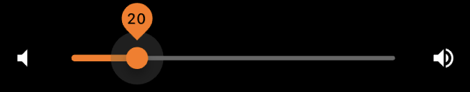
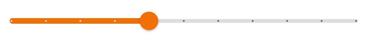
Discrete slider
Discrete sliders display a numeric value label upon pressing the thumb, which allows a user to input an exact value.
With icons:
In your screen you can use:
return OdsSlider(
  value: 20.0,
  steps: 10,
);
You can add icons to the discrete slider like this:
 return OdsSlider(
  value: 20.0,
  steps: 10,
  startIcon: Icon(Icons.volume_mute),
  endIcon: Icon(Icons.volume_up),
);
Component specific tokens
Soon available