Cards
Cards contain content and actions about a single subject.
Page Summary
- Table of contents
- Specifications references
- Accessibility
- Variants
Specifications references
Accessibility
Please follow accessibility criteria for development
Variants
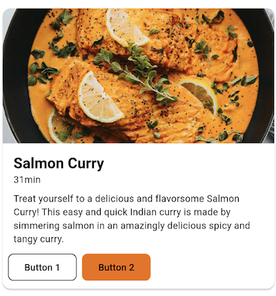
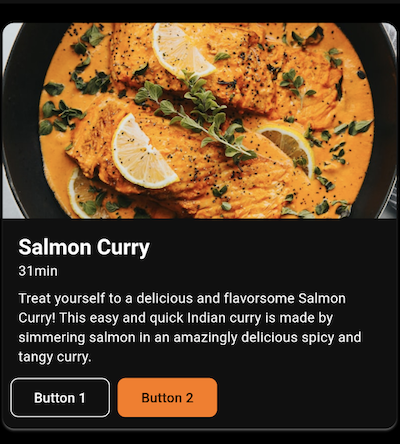
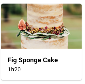
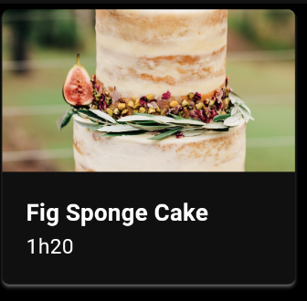
Vertical image first card
This is a full width card containing elements arranged vertically with an image as first element.
Flutter implementation
In your screen you can use OdsVerticalImageFirstCard :
return OdsVerticalImageFirstCard(
  title: "Title",
  image: OdsCardImage(
    imageProvider: NetworkImage('assets/placeholder.png'),
    contentDescription: 'Picture content description', //Optional
    alignment: Alignment.center, //Optional. Center by default.
    contentScale: BoxFit.cover, //Optional. BoxFit.cover by default.
  ),
  subtitle: "Subtitle", //Optional
  text: "Text", //Optional
  firstButton: OdsTextButton(text: "First button", onClick: () {}), //Optional
  secondButton: OdsTextButton(text: "Second button", onClick: () {}), //Optional
  onClick: () {},
);
OdsVerticalImageFirstCard API
| Parameter | Default value | Description |
|---|---|---|
title: String |
Title displayed into the card | |
image: OdsCardImage |
Image displayed into the card | |
subtitle: String? |
null |
Subtitle displayed into the card |
text: String? |
null |
Text displayed into the card |
firstButton: OdsTextButton? |
null |
First button displayed into the card |
secondButton: OdsTextButton? |
null |
Second button displayed into the card |
onClick: (() -> Void)? |
null |
Callback called on card click |
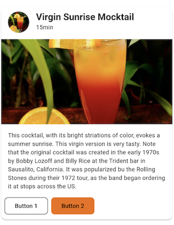
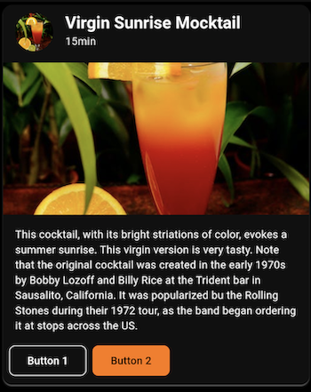
Vertical header first card
This is a full width card containing elements arranged vertically with a header (thumbnail, title & subtitle) as first element.
Flutter implementation
In your screen you can use OdsVerticalHeaderFirstCard :
return OdsVerticalHeaderFirstCard(
  title: "Title",
  thumbnail: OdsCardThumbnail(
    imageProvider: NetworkImage('assets/placeholder.png'),
    contentDescription: 'Picture content description', //Optional
    alignment: Alignment.center, //Optional. Center by default.
    contentScale: BoxFit.cover, //Optional. BoxFit.cover by default.
  ),
  image: OdsCardImage(
    imageProvider: NetworkImage('assets/placeholder.png'),
    contentDescription: 'Picture content description', //Optional
    alignment: Alignment.center, //Optional. Center by default.
    contentScale: BoxFit.cover, //Optional. BoxFit.cover by default.
  ),
  subtitle: "Subtitle", //Optional
  text: "Text", //Optional
  firstButton: OdsTextButton(text: "First button", onClick: () {}), //Optional
  secondButton: OdsTextButton(text: "Second button", onClick: () {}), //Optional
  onClick: () {},
);
OdsVerticalHeaderFirstCard API
| Parameter | Default value | Description |
|---|---|---|
title: String |
Title displayed into the card | |
image: OdsCardImage |
Image displayed into the card | |
subtitle: String? |
null |
Subtitle displayed into the card |
text: String? |
null |
Text displayed into the card |
firstButton: OdsTextButton? |
null |
First button displayed into the card |
secondButton: OdsTextButton? |
null |
Second button displayed into the card |
onClick: (() -> Void)? |
null |
Callback called on card click |
Small card
This is a small card which takes the half screen width.
Flutter implementation
You can add an OdsSmallCard in your screen to add a small card:
return OdsSmallCard(
  title: "Title",
  image: OdsCardImage(
    imageProvider: NetworkImage('assets/placeholder.png'),
    contentDescription: 'Picture content description', //Optional
    alignment: Alignment.center, //Optional. Center by default.
    contentScale: BoxFit.cover, //Optional. BoxFit.cover by default.
  ),
  subtitle: "Subtitle", //Optional
  onTap: () {},
);
OdsSmallCard API
| Parameter | Default value | Description |
|---|---|---|
title: String |
Title displayed into the card | |
image: OdsCardImage |
Image displayed into the card | |
subtitle: String? |
null |
Subtitle displayed into the card |
onTap: (() -> Void)? |
null |
Callback called on card click |
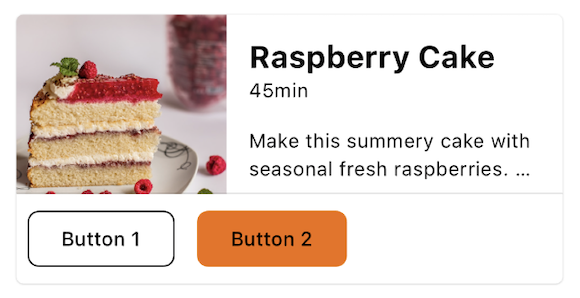
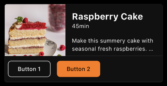
Horizontal card
This is a full screen width card with an image on the side. The image can be displayed on the left or on the right.
Flutter implementation
In your screen you can use OdsHorizontalCard composable:
return OdsHorizontalCard(
  title: "Title",
  image: OdsCardImage(
    imageProvider: NetworkImage('assets/placeholder.png'),
    contentDescription: 'Picture content description', //Optional
    alignment: Alignment.center, //Optional. Center by default.
    contentScale: BoxFit.cover, //Optional. BoxFit.cover by default.
  ),
  subtitle: "Subtitle", //Optional
  text: "Text", //Optional
  firstButton: OdsTextButton(text: "First button", onClick: () {}), //Optional
  secondButton: OdsTextButton(text: "Second button", onClick: () {}), //Optional
  imagePosition: OdsHorizontalCardImagePosition.start, //Optional. Start by default.
  divider: false, // Optional. True by default.
  onClick: () {},
);
OdsHorizontalCard API
| Parameter | Default value | Description |
|---|---|---|
title: String |
Title displayed into the card | |
image: OdsCardImage |
Image displayed into the card | |
subtitle: String? |
null |
Subtitle displayed into the card |
text: String? |
null |
Text displayed into the card |
firstButton: OdsTextButton? |
null |
First button displayed into the card |
secondButton: OdsTextButton? |
null |
Second button displayed into the card |
imagePosition: OdsHorizontalCardImagePosition |
OdsHorizontalCardImagePosition.Start |
Position of the image within the card, it can be set to OdsHorizontalCardImagePosition.start or OdsHorizontalCardImagePosition.end
|
divider: Boolean |
false |
Controls the divider display. If true, it will be displayed between the card content and the action buttons. |
onClick: (() -> Void)? |
null |
Callback called on card click |