Tabs
Tabs organize content across different screens, data sets, and other interactions.
Page Summary
Specifications references
- Design System Manager - Tabs
- Material Design - Tabs
- Technical documentation soon available
Accessibility
Please follow accessibility criteria for development
Variants
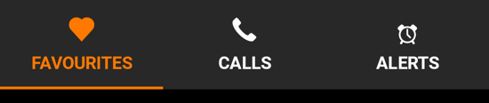
Fixed tabs
Fixed tabs display all tabs on one screen, with each tab at a fixed width. The width of each tab is determined by dividing the number of tabs by the screen width. They don’t scroll to reveal more tabs; the visible tab set represents the only tabs available.
Flutter implementation
In Compose, the fixed tabs should be added inside of an OdsTabRow.
The used composable for tab depends on the type of tabs to display: classic OdsTab or OdsLeadingIconTab.
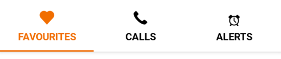
OdsTab composable:
This composable allows to display:
- an icon only tab
- a text label only tab
- a tab with an icon on top of text label
class _NavBarDemoState extends State<_NavBarDemo> {
  late int selectedIndex;

  @override
  void initState() {
    super.initState();
    selectedIndex = 1;
  }

  @override
  Widget build(BuildContext context) {
    List<Widget> navigationDestinations = _destinations(context).sublist(0, 3);

    return SafeArea(
      child: SingleChildScrollView(
        padding: EdgeInsets.only(bottom: 100),
        child: Column(
          crossAxisAlignment: CrossAxisAlignment.center,
          children: [
            /// Screens for each navigation destination
            SizedBox(
              height: 110,
              child: IndexedStack(
                index: selectedIndex,
                children: [
                  Center(child: Text('Favourites')),
                  Center(child: Text('Calls')),
                  Center(child: Text('Alerts')),
                ],
              ),
            ),

            /// Navigation Bar icon
            Padding(
              padding: EdgeInsets.all(spacingM),
              child: Align(
                alignment: Alignment.center,
                child: OdsNavigationBar(
                  selectedIndex: selectedIndex,
                  onDestinationSelected: (index) {
                    setState(() {
                      selectedIndex = index;
                    });
                  },
                  destinations: navigationDestinations,
                ),
              ),
            ),
          ],
        ),
      ),
    );
  }
}
OdsLeadingIconTab composable:
If icons are provided in SVG format the system does not apply right color on images if selected. So we need to provide icon: and selectedIcon: parameters with right colorFilter using theme like this :
  List<NavigationDestination> _destinations(BuildContext context) {
    var colorScheme = Theme.of(context).colorScheme;

    var activeColorFilter =
        ColorFilter.mode(colorScheme.primary, BlendMode.srcIn);
    var colorFilter = ColorFilter.mode(colorScheme.secondary, BlendMode.srcIn);
    return [
      NavigationDestination(
          tooltip: '',
          icon: SvgPicture.asset("assets/recipes/ic_favourites.svg",
              colorFilter: colorFilter),
          selectedIcon: SvgPicture.asset("assets/recipes/ic_favourites.svg",
              colorFilter: activeColorFilter),
          label: "Favourites"),
      NavigationDestination(
          tooltip: '',
          icon: SvgPicture.asset("assets/recipes/ic_calls.svg",
              colorFilter: colorFilter),
          selectedIcon: SvgPicture.asset("assets/recipes/ic_calls.svg",
              colorFilter: activeColorFilter),
          label: "Calls"),
      NavigationDestination(
          tooltip: '',
          icon: SvgPicture.asset("assets/recipes/ic_alertes.svg",
              colorFilter: colorFilter),
          selectedIcon: SvgPicture.asset("assets/recipes/ic_alertes.svg",
              colorFilter: activeColorFilter),
          label: "Alertes"),
    ];
  }
Component specific tokens
Soon available